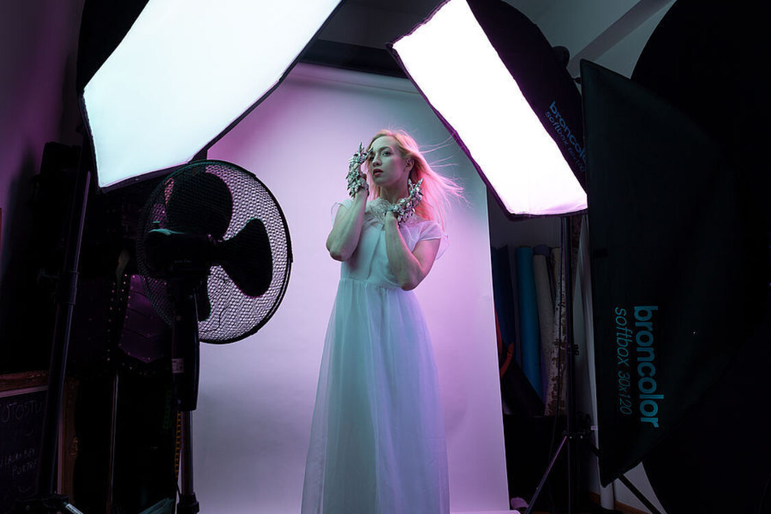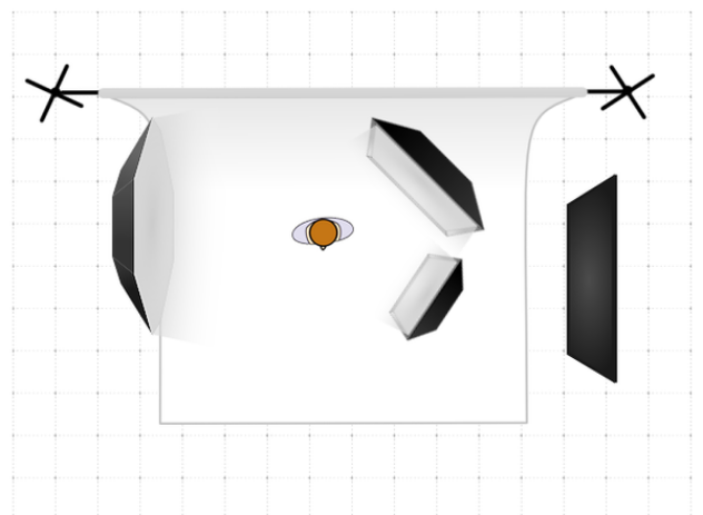
When working in a small studio space, there is always a certain limitation that you encounter. Be it because your ceilings are not high enough or you can barely get two lamps in there. While this may be an obstacle that is hard to overcome, it also gives a lot of opportunities to keep pushing, discovering and creating new light set-ups. The light set-up, that I’ve built lately, allows me to create countless atmospheres and looks, without changing anything on my lamps except the gels.
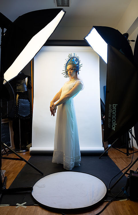
For this shoot I worked again with Jasmijn, “My Fragility”. We dressed her with a vintage outfit from my own wardrobe and two pieces from polish designer Agnieszka Osipa.
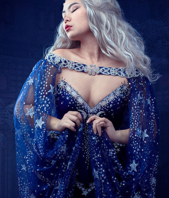
For this particular set, I tried three different colour combinations. The first being teal, yellow and pink, the second purple, teal and magenta and the third being yellow, green and orange. While the last one didn’t completely work out, the first two created stunning results with a minimum of post-processing.