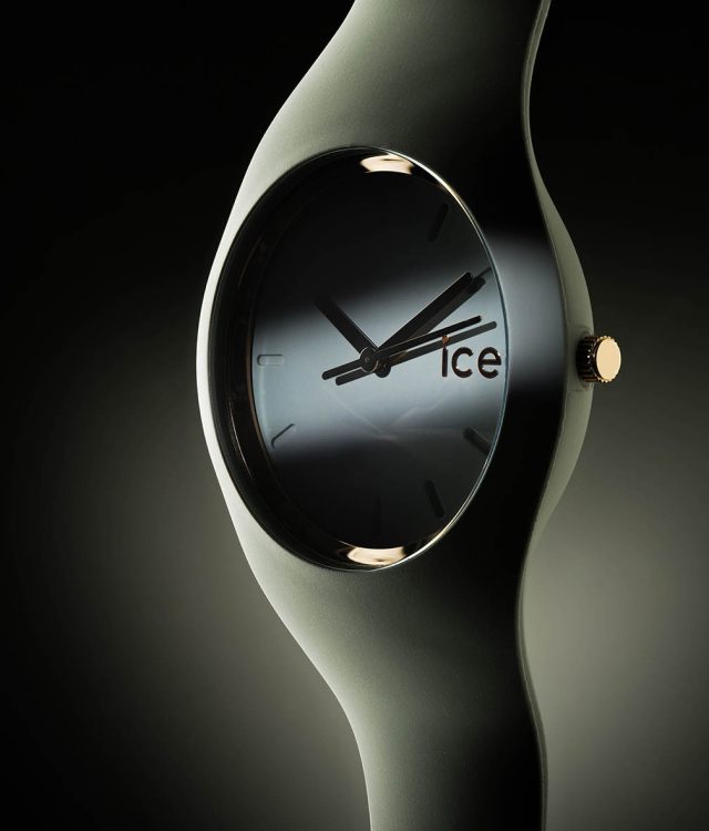
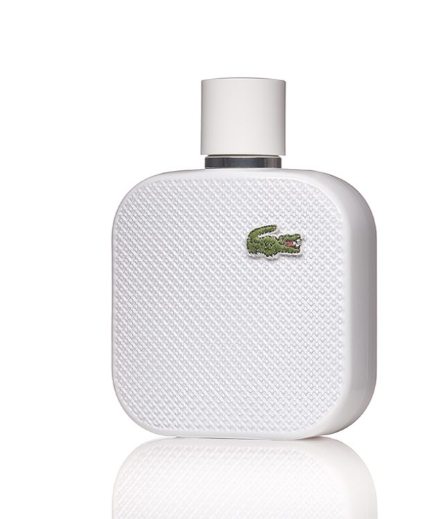
In photography courses, students are taught that art reproductions of flat objects have to follow a clearly defined recipe: The aim is to achieve homogeneous illumination, which is usually done with a symmetrical setup. Two or more soft light sources with identical power are set up at an angle of around 45°.
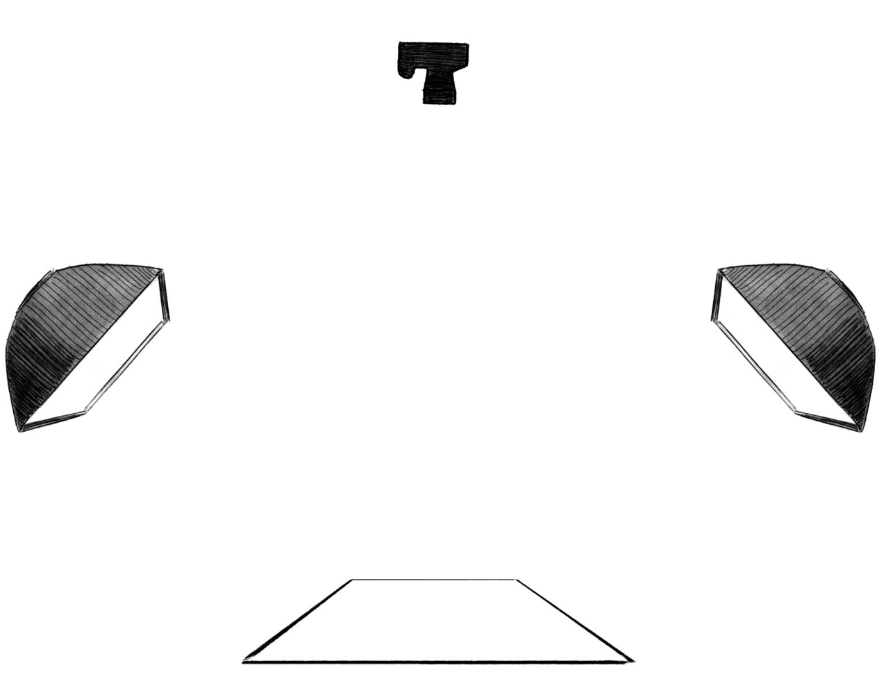
There is no objection to uniform illumination; after all, the differences in brightness of the work should be reproduced true to the original. However, in my personal opinion, the symmetry of the light only makes sense very rarely, namely with absolutely flat originals such as photographs. In contrast, the structure of a watercolour paper would be completely lost in a softly symmetrical light.
So it makes much more sense to interpret art reproductions as product shots, to respond to the respective work in terms of lighting and not to flash it to death according to supposedly "correct school rules".
In the following I will describe how I reproduced three works of art according to their nature; without having aimed at, it turned out that in each case a single light source did the job best!
These are three works by the artist Nicole Schraner.
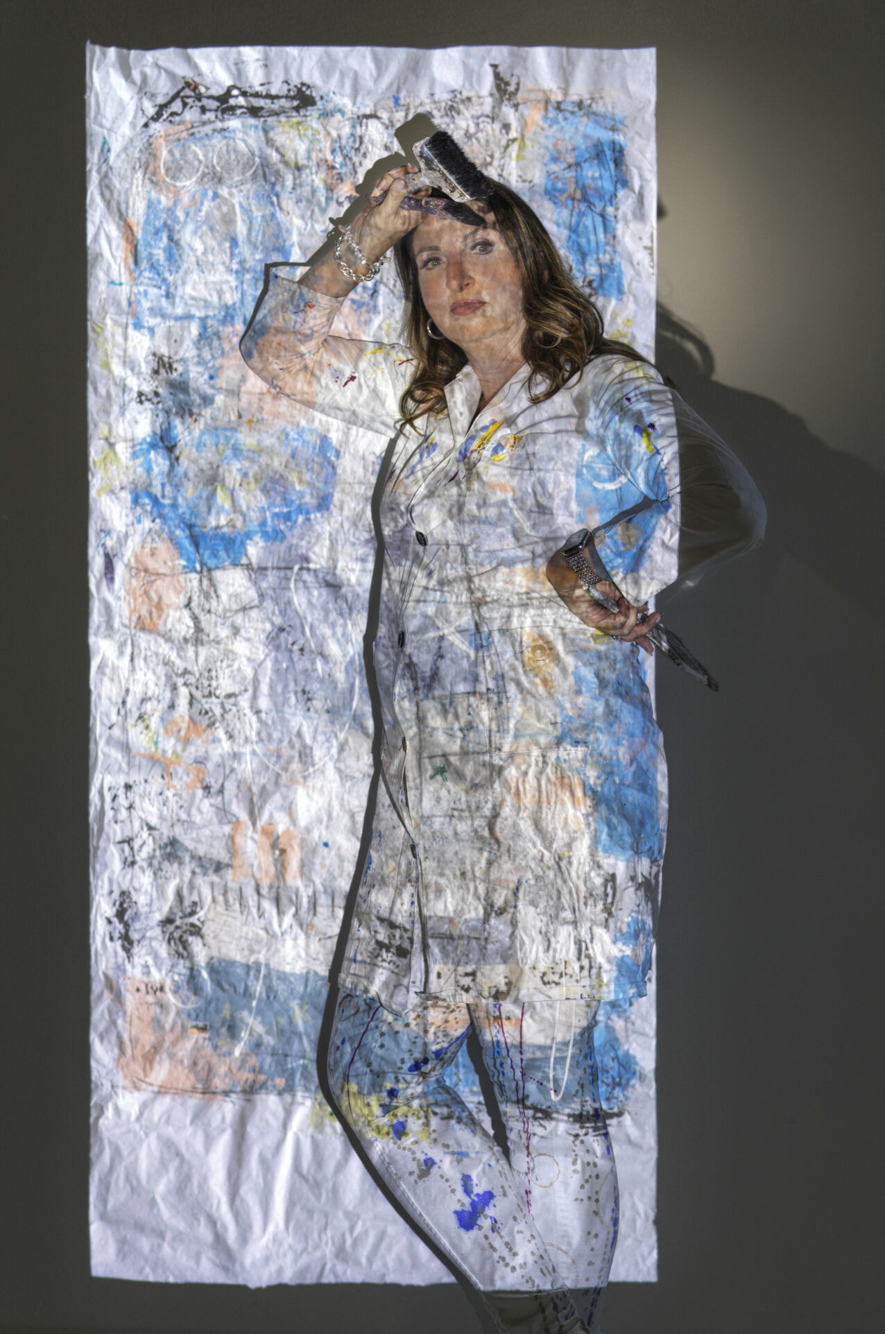
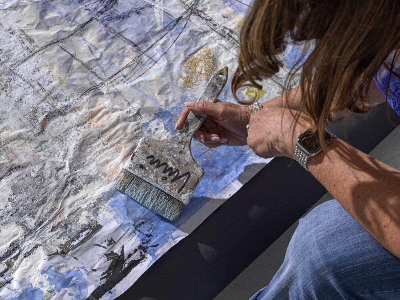
Nicole Schraner, in the light of the projection of one of her paintings (work in progress). (Additional light on the face by a Picolite with Fresnel spot attachment).
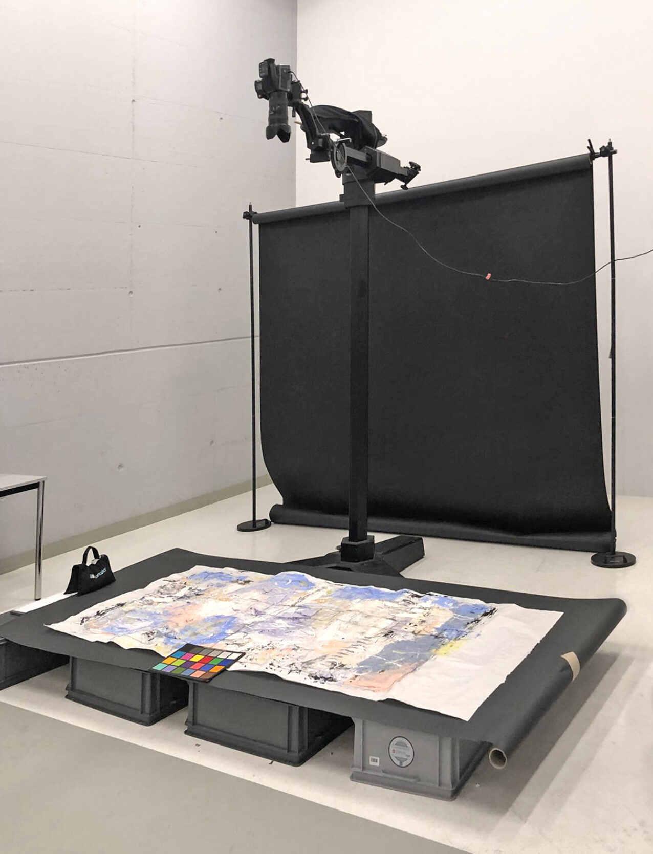
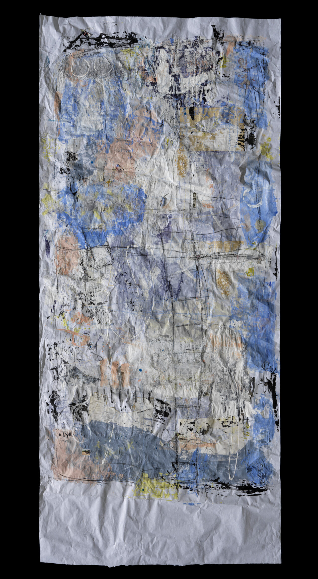
First, we took on a painting that was not yet finished. It was about a metre wide, over 2 metres high and painted on heavily creased paper. Of course, this feature had to be translated photographically. I therefore decided to use a single, hard light source: a P70 standard reflector on a Pulso G lamp, which in turn was connected to a Scoro 3200 S WiFi power pack. Since the image was very large and, of course, homogeneous illumination was also the goal in this situation, I set up the lamp at a distance of around 10 metres. From 10 to 11 metres, a light source only loses about 2/10 f-stops, which was easily compensated by fully focusing the lamp and aligning it.
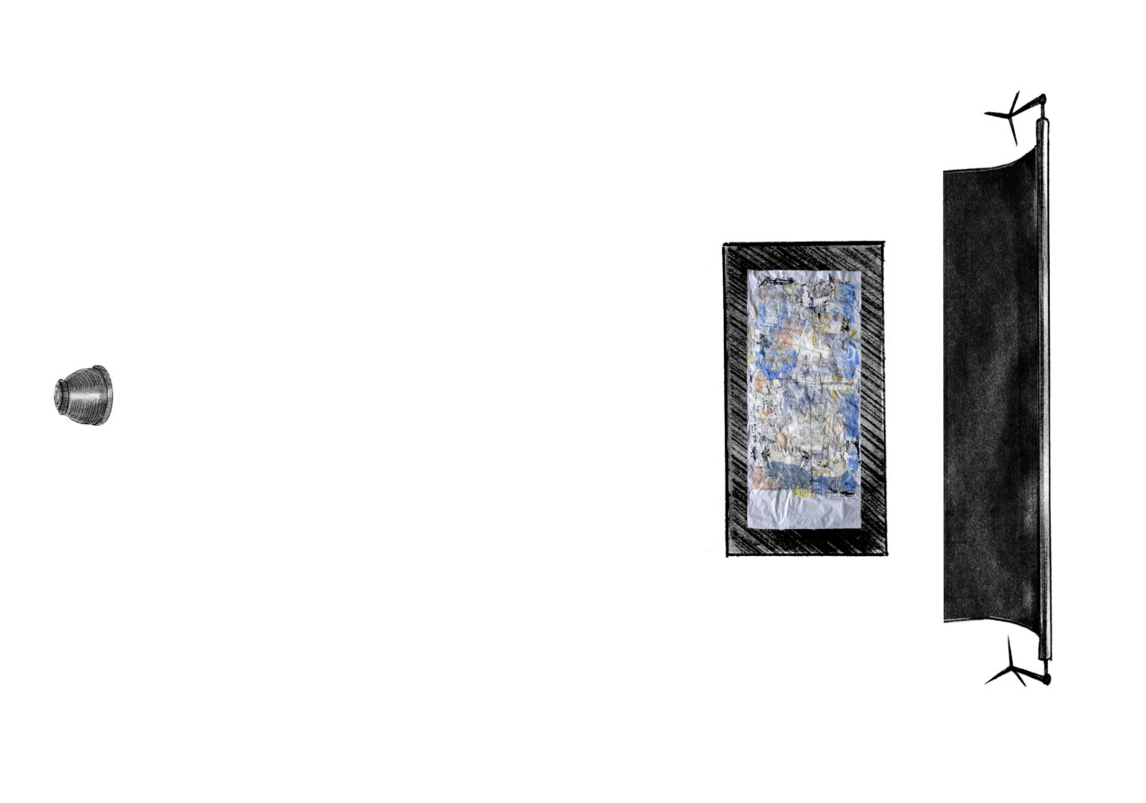
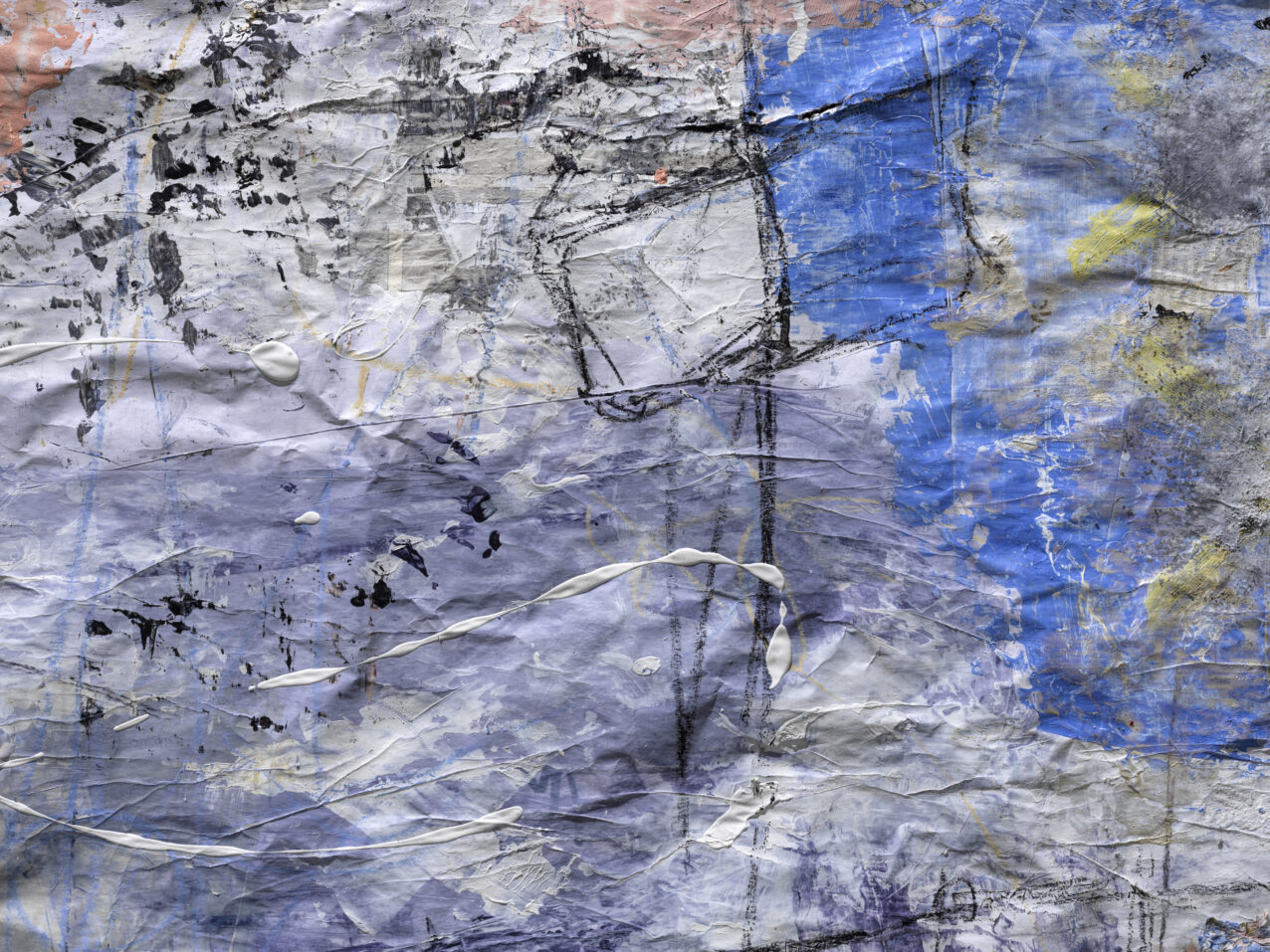
Since the light source was only 3 metres high despite the large distance, the light fell on the painting at a flat angle of around 17° and optimally emphasised the structure of the paint and the paper.
Detail:
Work in progress:
Instead of brightening up the side facing away from the light, I placed a black background paper to further increase the contrast and thus the plasticity.
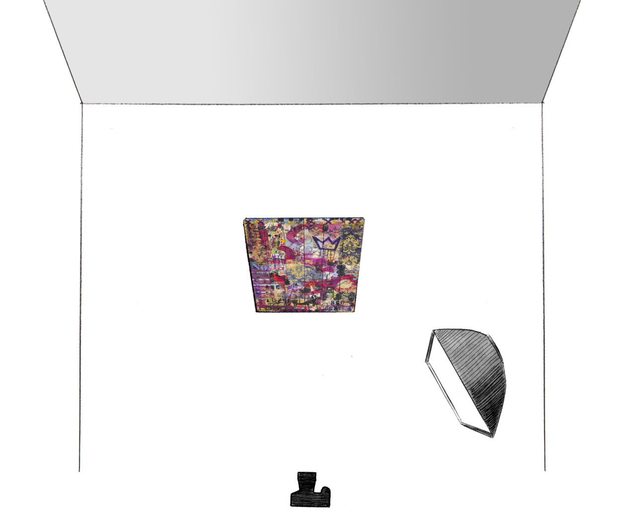
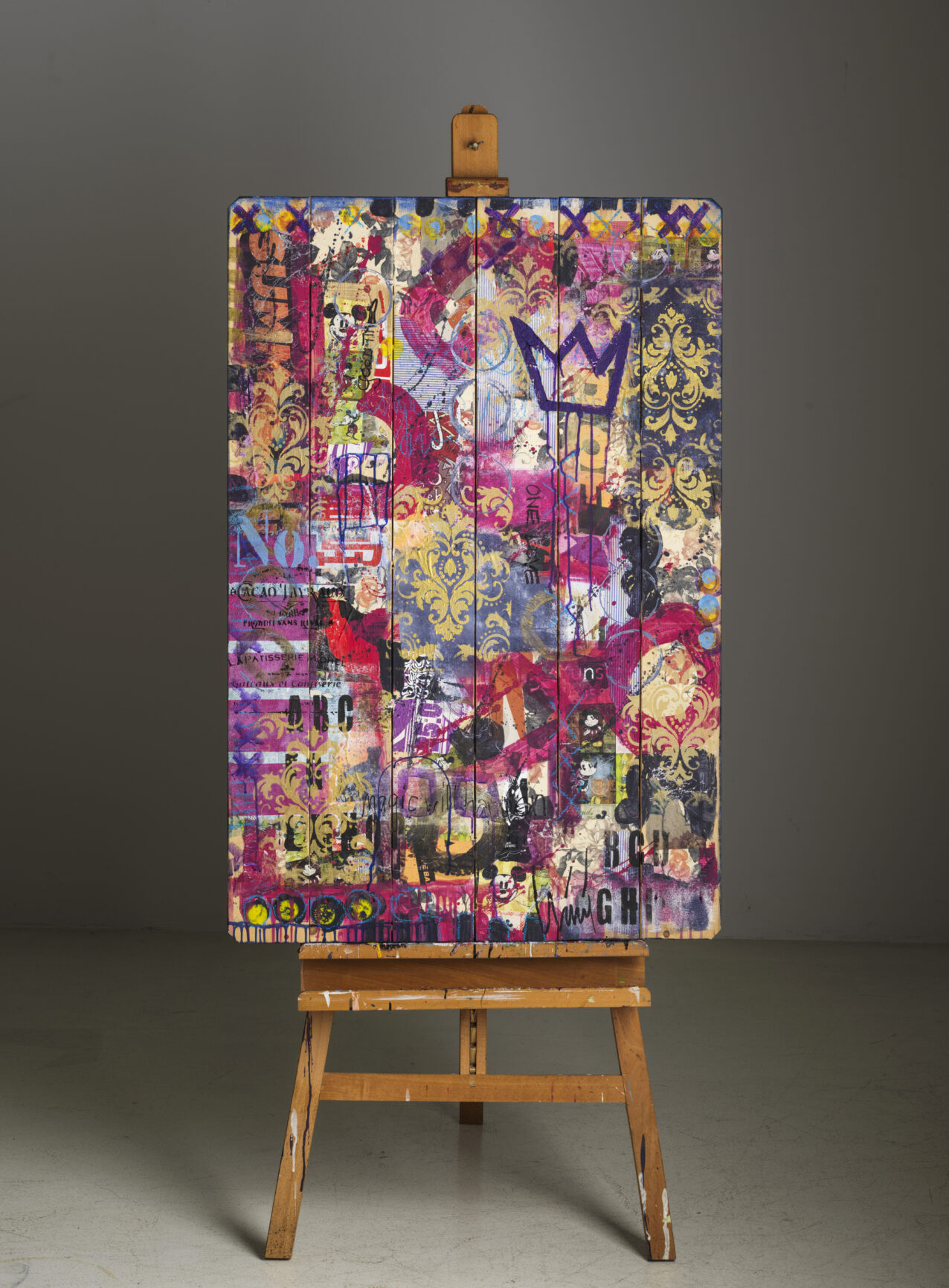
To prevent too dominant glossy areas on the second reproduction, I worked with a soft light: a softbox with side lengths of 120 or 180 cm.
Homogeneity could no longer be obtained with a large distance between the light source and the object (this would have made the light harder again) but had to be achieved through the orientation of the softbox.
To achieve this, I turned it away from the object and more towards the camera. Since the picture, painted on a wooden palette, was thus somewhat on the edge of the light, the light fall-off due to the short distance could be compensated.
The shadows were not lightened here either, which resulted in a clearer structure of the applied paint and a clearer separation of the individual boards of the palette:

The non-uniformity of the studio wall behind the painting is also due to the orientation of the light source: on the right, the gradation of the edge is apparent, and on the left, the inherent shadow of the easel with the palette.
The third and last work was the smallest and had several layers.
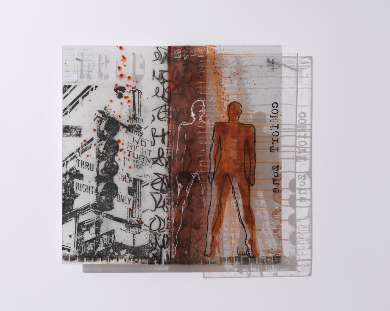
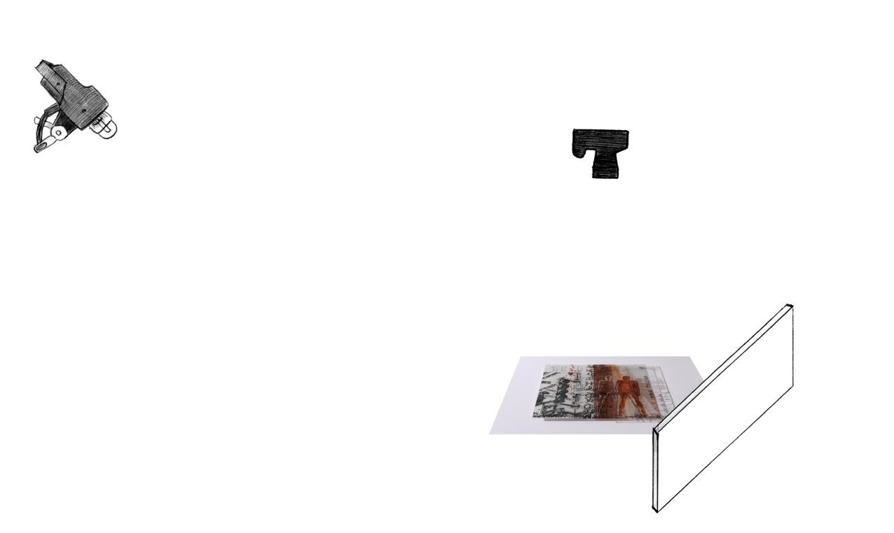
It was very important to the artist that both the transparency of the painted plexiglass plates and the play of shadows were realised photographically. We achieved the transparency by mounting the artwork on a white background and the clearest possible hard shadows by using the smallest possible light source. For this purpose, I removed the P70 reflector from the Pulso G lamp and photographed only with an open flash tube.
Since this work was much smaller than the first, a distance of about 3 metres was sufficient. However, the grey studio walls did not reflect sufficient light to make the shadows appear bright enough; they dominated the photo too much. Therefore, a white reflector was positioned on the side facing away from the light. This reduced the contrast and supported the homogeneity of the illumination.
Art by:
Nicole Schraner www.niniart.ch
www.instagram.com/nini...


