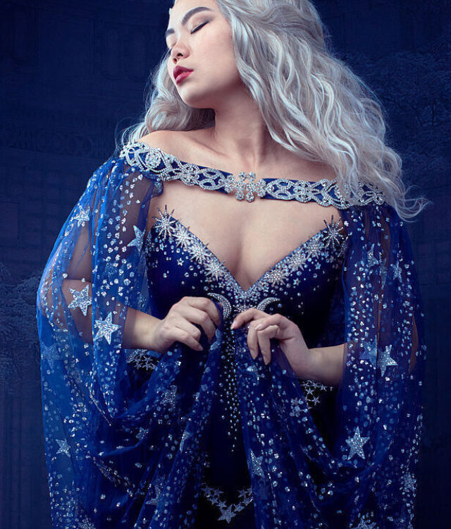
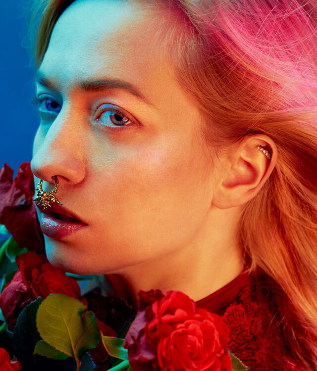
If there is something a lot of people worry about, it’s space – or the lack of it. And how one is able to create stunning, head-turning work if there is nothing more than free space in a small extra room or even between your couch and desk. How does one set up multiple lights if one can barely set up one giant Octabox? It’s what I’m used to and what I’m always trying to push more and more, never giving in to the limitations and always walking that line.
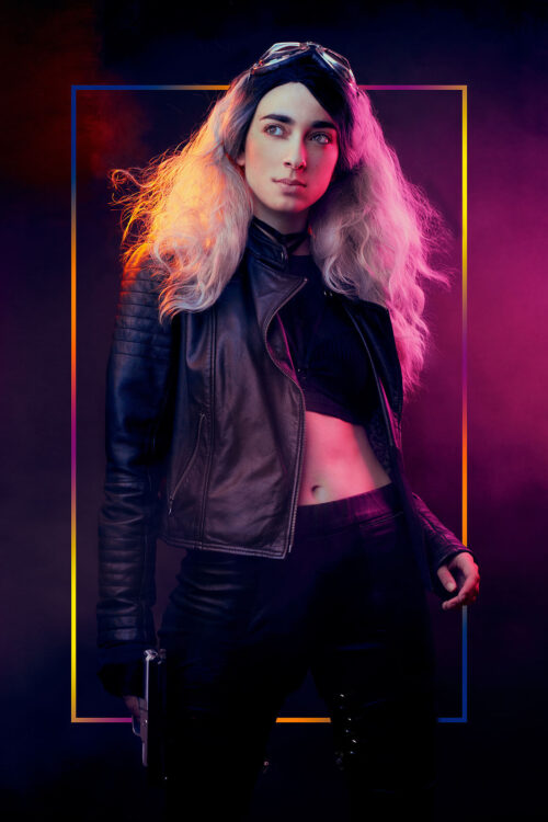
This shoot - which is part of a new little series called “After Utopia” – is inspired by the cyberpunk/dystopian genre and is fuelled by everything both colourful and dark, with strong characters and a lot of diversity. It’s a genre and aesthetic close to my heart so it was a lot of fun to start working on this series.
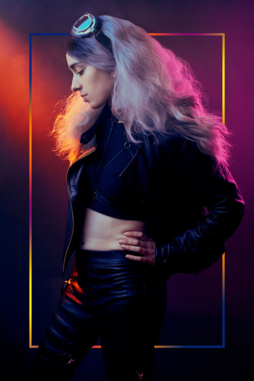
For this concept I wanted to try and use some of the modifiers that I’ve barely used before, but slowly have been falling in love with for on location work: the P45 with a honeycomb grid. It’s a pretty strong modifier for a small studio location so it took me a bit to figure out as often it would blow out the highlights, even at the lowest power. The key to it was diffusing it using something very simple: smoke. It became a beam of light that, with a colored gel and my to-go-to setup of an Octabox and a softbox (with a colorgel as well). Though the P45 modifier is what made these images stand out amongst my earlier work; with the addition of real smoke on set.
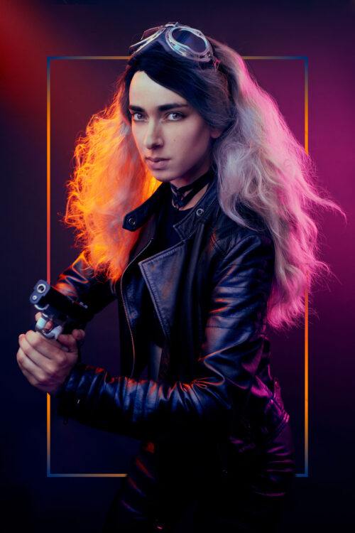
For this I used the Siros L 800 with an Octabox as my main light source, with my Move 1200 and 2 MobiLEDs: with the P45 on one and the 60x100 softbox on the other. I also used an additional reflector on the ground to bounce some of the light back to not lose too many details.
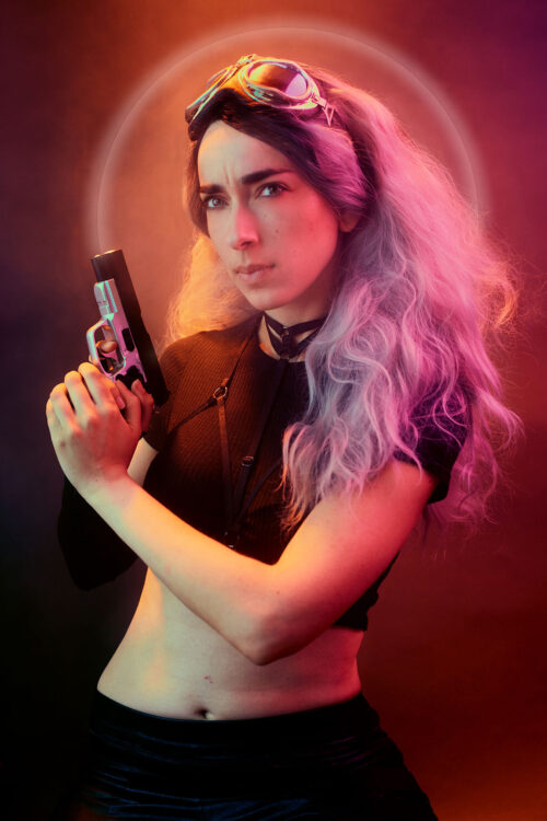
Last but not least there was a fan, which also took care of bringing in some movement in the hair to make the image more dramatic, but it also helped with spreading the smoke around so it wouldn’t be “a cluster” and hang around.
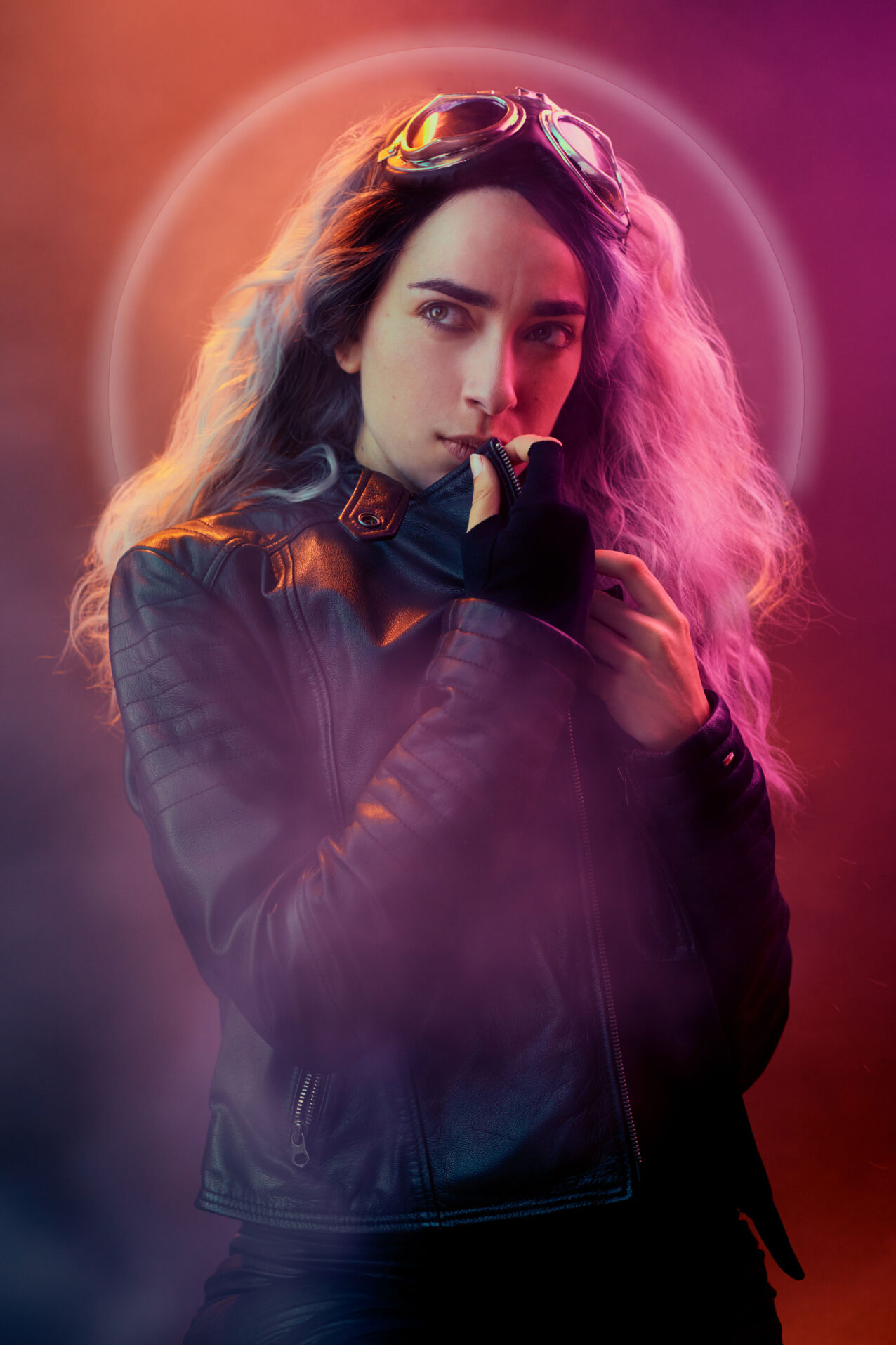
Because it was heavily inspired by the Cyberpunk theme, I looked into neon lights thought they had proven to be too expensive for a test run. Since I was using a lot more of “graphical” additions in my painterly/contemporary photography I had the idea to incorporate this but make it more vibrant and modern; resulting in rectangles with a gradiant behind the model. For some other shots I decided not to use this or my classic “halo” effect with a little touch of vibrance at the edge.
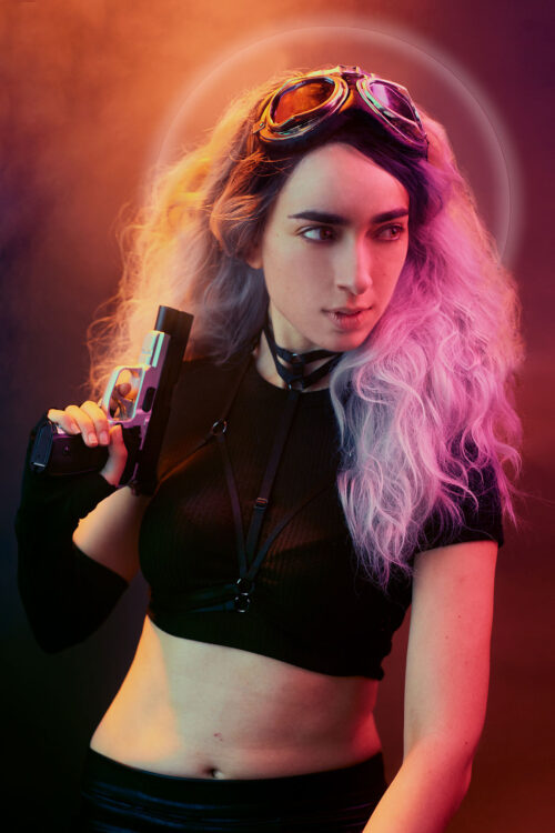
The result is fun, modern with a touch of creativity and a lot of colour, which is my absolute favorite! Most importantly: anyone can achieve awesome results like this, because all that’s matters is what you shoot in the frame, not what’s outside it. A good light set-up and lamps on their own – which broncolor definitely offers – makes everything just perfect for the rest.


