«Red Queen» is a conceptual fashion project that revolves around the idea of how conversations about menstruation are being suppressed and precepted as something dirty by societies and something to hide and be ashamed of by women in general. This is especially the case in India, where I am currently based.
If you are discussing your cycle in public, you will be asked to lower your voice and people will stare at you and judge. Also, men tend to get uncomfortable when mention this topic. Even medical stores pack their pads and tampons in newspaper so that no one knows you are buying them. I believe that fashion plays a big role in this conversation as a powerful tool that speaks to masses - so does photography. Therefore, I made this photo project keeping several things in mind:

- To make sure this conversation continues
- To show the beautiful side that menstrual cycle represents: a birth of a woman from a girl as well as showing the fertility and power
- To remove a taboo that is currently around the subject
I used textures and colours to convey the concept, introducing such elements as red paint, flowers (symbolizing bloom) and berries (symbolizing ovaries).
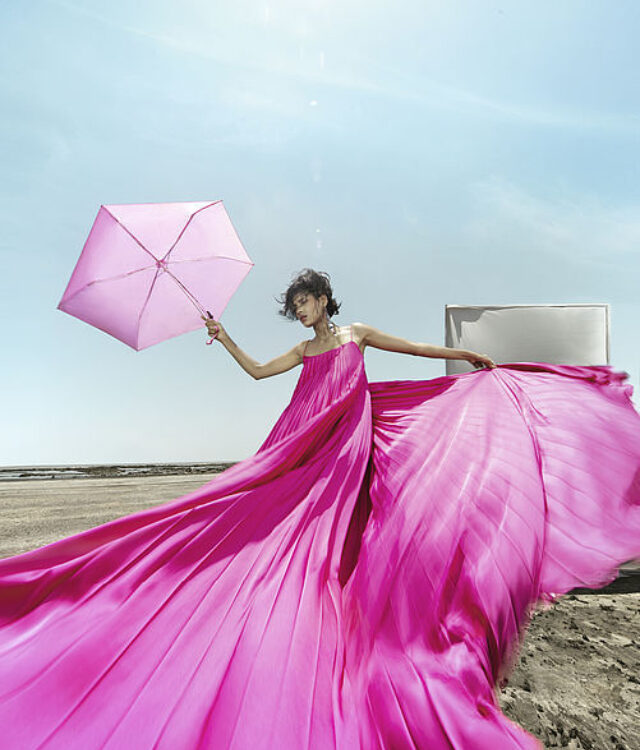
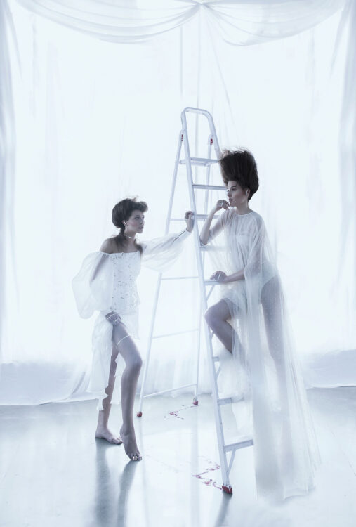
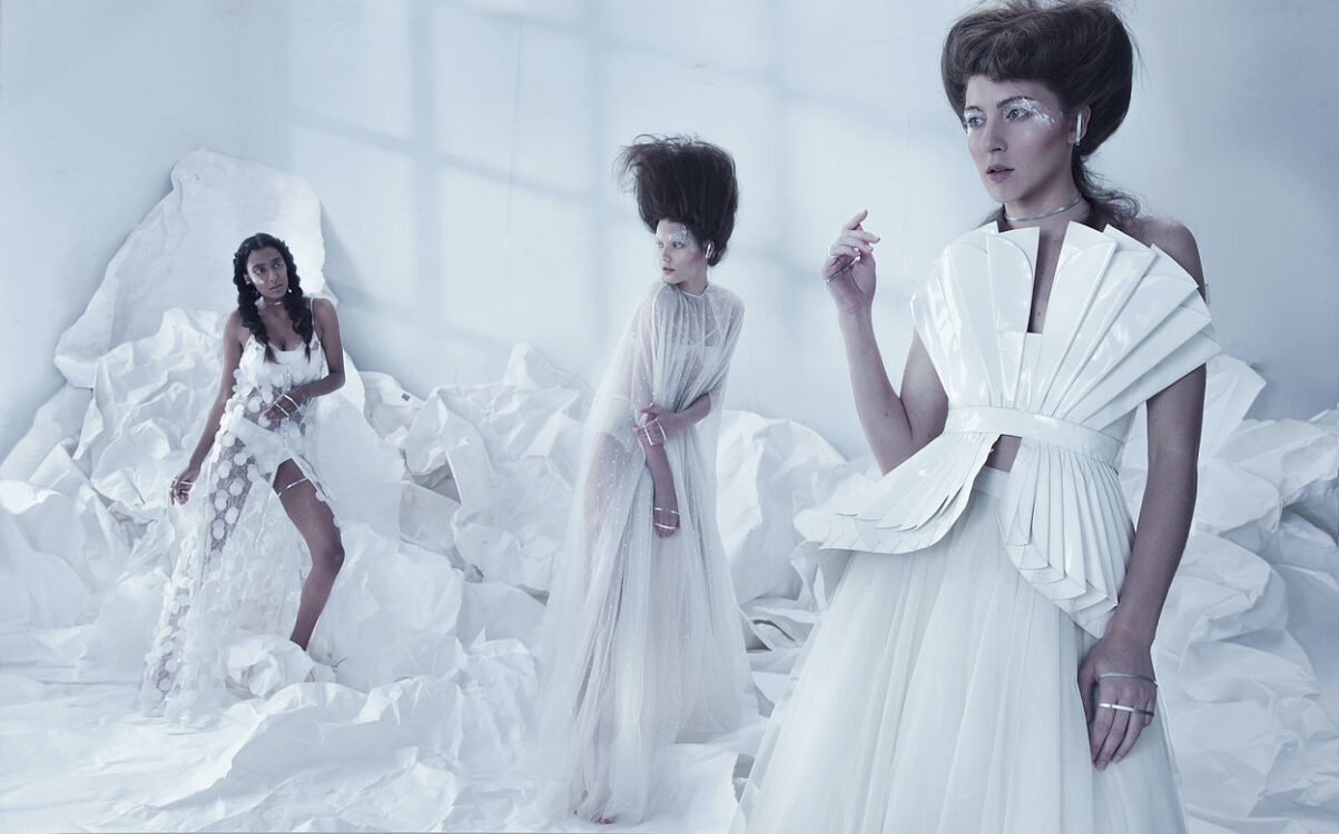
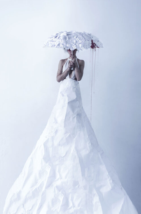
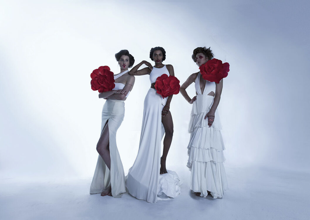
The project featured a multinational team. I worked with three models for this photoshoot - from India, Brazil and from Poland. The photo project consists of three stages. It starts with all white frames representing «the cult of purity» and the pressure of staying clean. In the second stage you will see a lot of white and red in the frame which symbolizes «the bloom» of a woman. The third stage, «Red Queen», is dominated by red colours representing women accepting their womanhood as well as owning and flaunting it without being afraid of any judgement.
Having all these requirements in mind, I had to plan the set and the lighting especially careful for this photoshoot. My goal was to emphasise the transition of softer combinations of strobes and natural light to using only strobes. At the same time all the imagery needed to maintain unity and give the feeling that they relate to each other. This was one of the major lighting challenges.

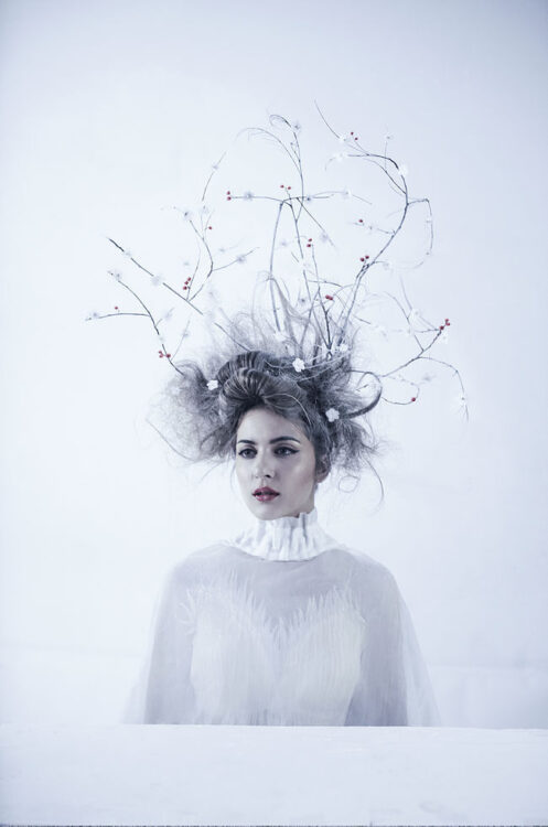
The Cult of Purity
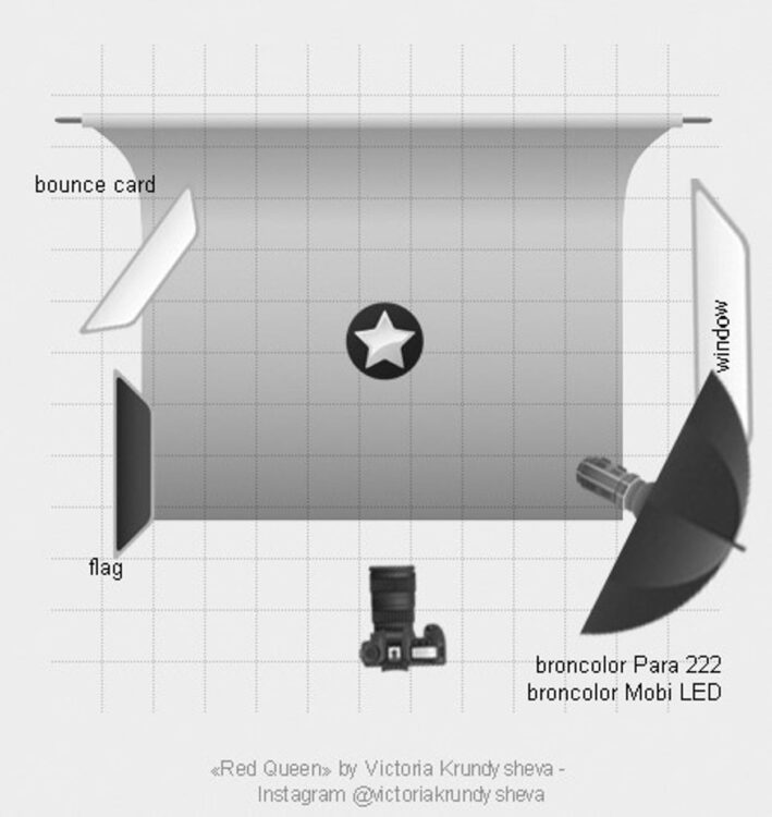
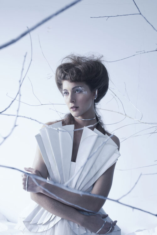
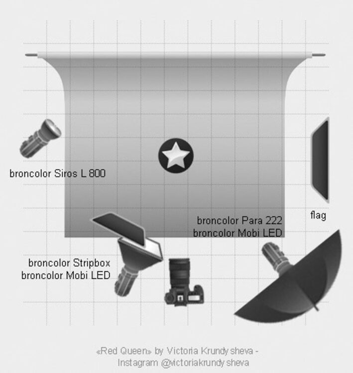
For the first stage of the project, «the cult of purity», the frames had to be clean, white and soft. As I focused on having a bright background and set, I could also utilize the reflective abilities of the white colour to provide additional soft bounce to all the other lights I was using. My main light for the first set was a MobiLED. I attached rather big light shapers to it, such as the Para 220 and an Octabox. I kept the distance far from the model and set the light to lesser intensity, with ISO beyond 200 to ensure leak of natural light in my frame. On set 1 I had my model stand against a large window with a white bounce card on the other side to keep shadows present, but soft. I placed the Para on the side of the window to work together with natural light - enhancing the natural light, rather than overpowering it. Nevertheless, the area that the Para covered needed to be kept in check for the model to still have shadows present. Therefore, I placed a black flag from a slight angle opposite the Para.
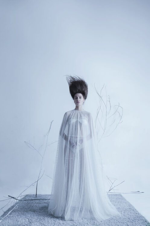
For the Para specifically, I added a diffuser number 2. This gave me an even softer effect. This combination resulted in surreal ephemeral feel of the frame, considering my model was dressed in white semi-transparent outfit as well. It also helped me preserve the textures of the dresses.
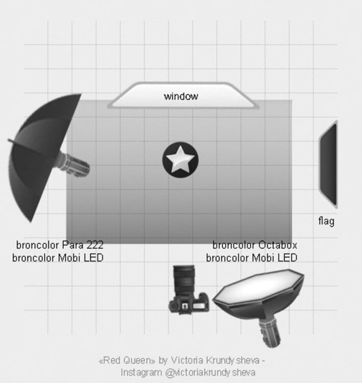
In the next set up, I also used quite a bit of natural light, this time as a backlight for my models. Here, I also used two MobiLEDs, one with a Para on minimal intensity placed as a sidelight and an Octabox far away from my models giving a fill from the front.
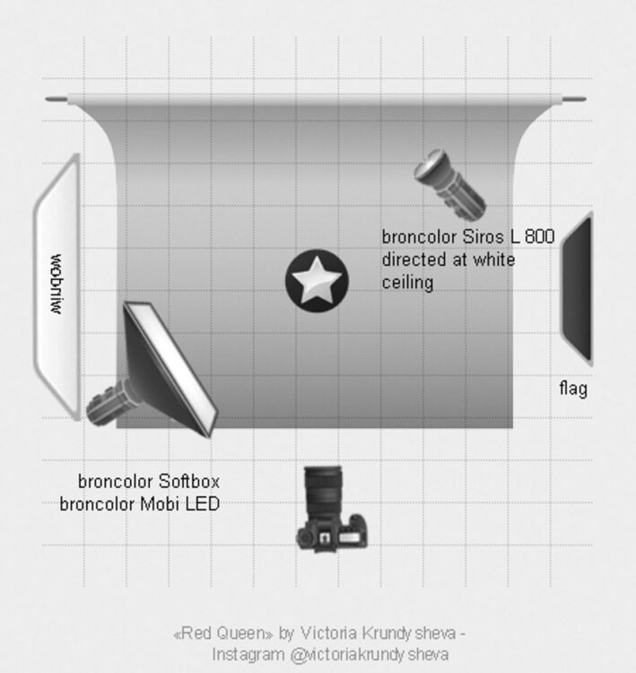
Third set required preserving the paper texture and not overexposing it. This set featured another large window from the side. Therefore, there was plenty of natural light there. The challenge here was to not oppose the natural light with the Para and the Octabox that I was using but rather complement it. Additionally, I directed a Siros L 800 towards the white ceiling to provide mild bounced light on the model’s hair. I also I introduced a flag opposite the window to preserve the natural soft light feel of my frame.
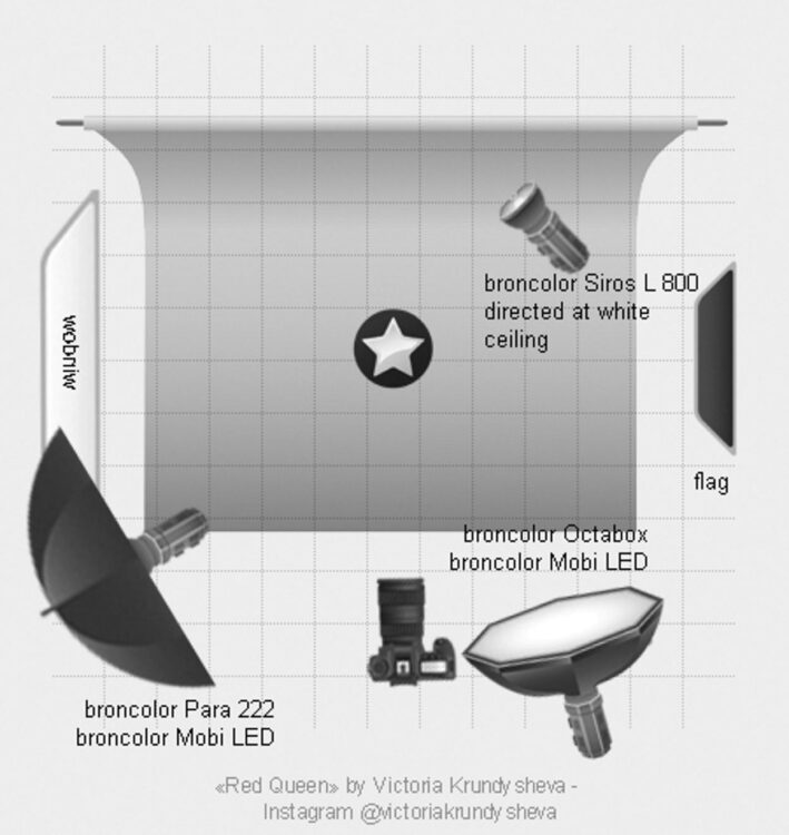
For the third set within «The Cult of Purity» I had to play around with bouncing light for quite a bit when I was shooting the portraits. To give my model a slight separation from background, I have directed a MobiLED with a Softbox attached to the wall. The same light also illuminated the model’s side slightly. This made the wall behind my model a bit brighter and gave additional depth to the image. I also used the Siros 800 L again and directed it towards the ceiling in order to brighten the hair. All of it while still using the natural light simultaneously. With the flag on the opposite side, I was able to soften the shadows.
The Bloom
For the next stage, I started to include red colour into the frames as well as the transition from lighter and softer frames to a bit harder and more defined. My goal here was to add a dramatic effect and maintain image depth. In the first images of this set I created the smooth transition still using the MobiLED with the Para to complement the natural light.
The next set is where I changed it up. By bouncing the Siros L off the top side of the white wall I made the models stand out from the background. At the same time, I felt that a pinch of darkness will help contrast the white and red combination. Thus, I added a Para on a MobiLED from the front, which was set to minimal intensity. There is a specific challenge in managing the creative lighting when you have a diversity of skin tones in your frame. If I wanted the light to be minimal and keep it from one direction, I would have risked either overexposing the light skin tones or underexposing the darker skin tones. Both cases would have thrown my frame off balance. Since I wanted to have the model with the darker skin tone to be in the centre, I had to include an additional narrow source of light, that would not affect the two light-skinned models next to her. For this task, I used a MobiLED and attached a stripbox to it. Additionally, I cut it from the side to make the light stream even more narrow.
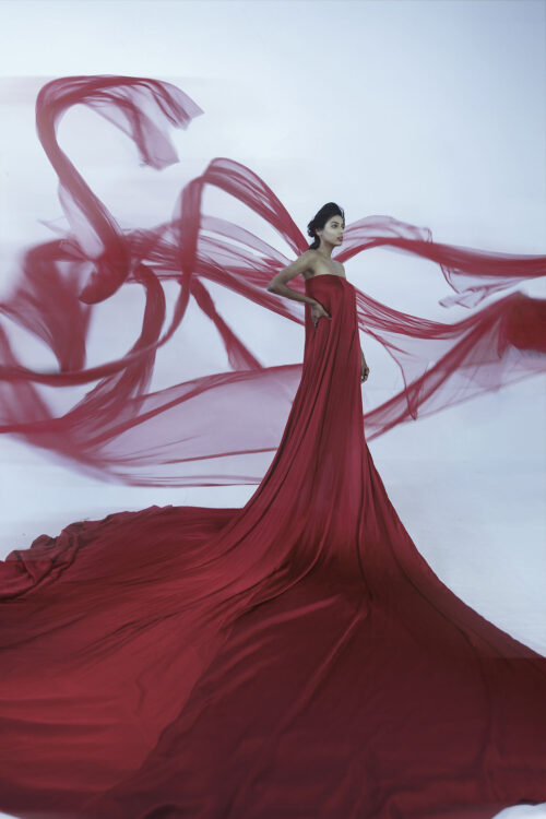
Red Queen
The final set which had red dominating the images, allowed me a simpler light set up. Here, I only used the MobiLED lamp with a Para attached to it.
Conceptual fashion can be a challenging genre since the idea and the vision you have has to play a central part in framing, styling, and lighting as well. It gets even more difficult if you need to change your lighting throughout your concept. However, both broncolor and me have proven to stand tall against these challenges. The final results are exactly what I expected.