Not long following our shoot in Lanzarote, we were loading up the cars and trailer for another week-long stint at the splendiferous Château Challain in France, for a premium Fashion Shoot Experience with an intimate group of photographers hailing from round the world.
This blog post takes you behind the scenes on the shooting, lighting and the post-production approach to achieving the final fairytale images of ‘Chateau Chique’.
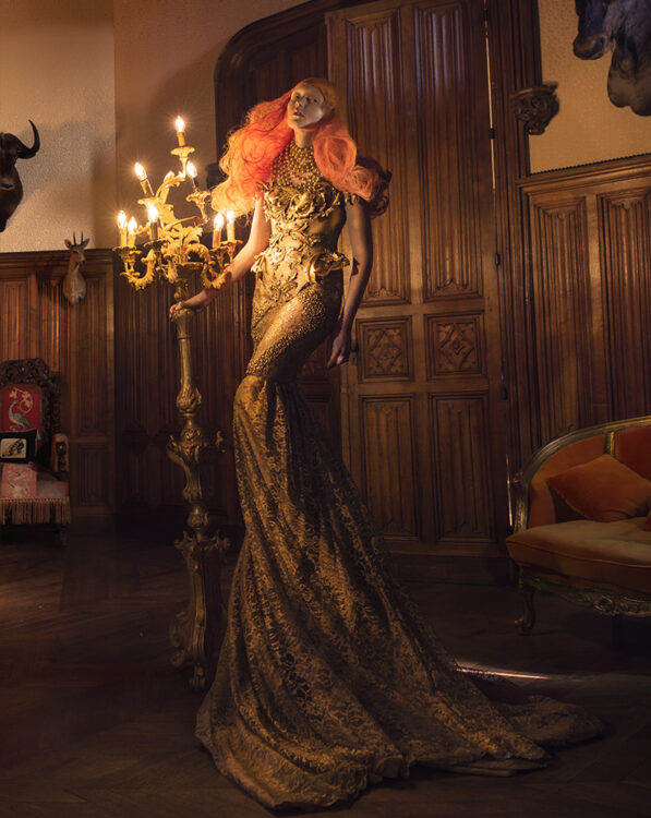
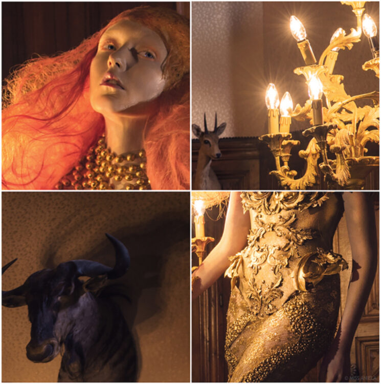
Close-up of Dawn Treader, details on the making further below.
Setting the brief
Where did it all start? We first shot at Chateau Challain in 2014. It’s the most incredibly beautiful building I’ve ever seen – check out the drone footage above. We knew we wanted to return because the place simply has it all: not just absolutely photogenic architecture and rooms, but the logistical feasibility for the scale of our crew and clients. It’s easy for us to drive there, it’s close to Nantes Airport for everyone else to fly to, and wine is bountiful – everyone’s happy.
The shoot was to take place in October and planning started months in advance. Chateau dates were booked at least 6 months beforehand, and designers were commissioned back in the spring.
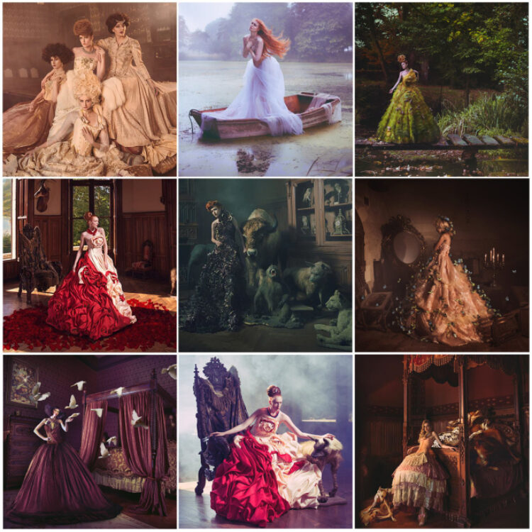
That was the logistical framework – the substance. As for the style, brief-wise, it was the wardrobe to first figure out for our vision for Chateau Chique. The flavour that generally goes with the chateau is obviously that of romantic, whimsical, and fantastical… big dresses, hairpieces, fairytale elegance, as we’d already done on our first shoot in 2014, ‘French Fairytale’ (selection of images below). So, how would we make this one different?
We wanted intricate but demure looks, using the last shoot as a basis to refine. Chateau Chique would hopefully raise the bar learning from the experience we gleaned last time. We commissioned wardrobe from London, Germany and China, with military jackets and ‘raggy Cinderella’ dresses, in addition to some voluminous fairytale bespoke pieces.
That was the brief for the production overall. My own personal brief within that, in terms of genre, was about making standalone fine-art pieces. For the other clients, they could shoot whatever they wanted: fashion stories or fine-art standalones, or experiment with whatever they fancied.
Wardrobe styling
For our 2014 shoot at Challain (see montage above) we’d commissioned a set of voluminous dresses from China, in addition to a few pieces from other designers and from theatre rental. Our surprise guest, Kirsty Mitchell, had sculpted my favourite look of the week which appeared in Elegant Elegy (middle image above). Overall we’d loved the adventure of making our own designs but also appreciated that we are wardrobe novices, so numerous looks were rough diamonds. The dress that appears in Forbidden Flower for example (third on middle row on montage above), is a dress that Matt in hindsight said he would have muted and muddied to give more texture and story.
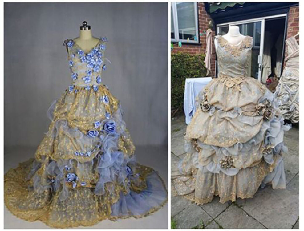
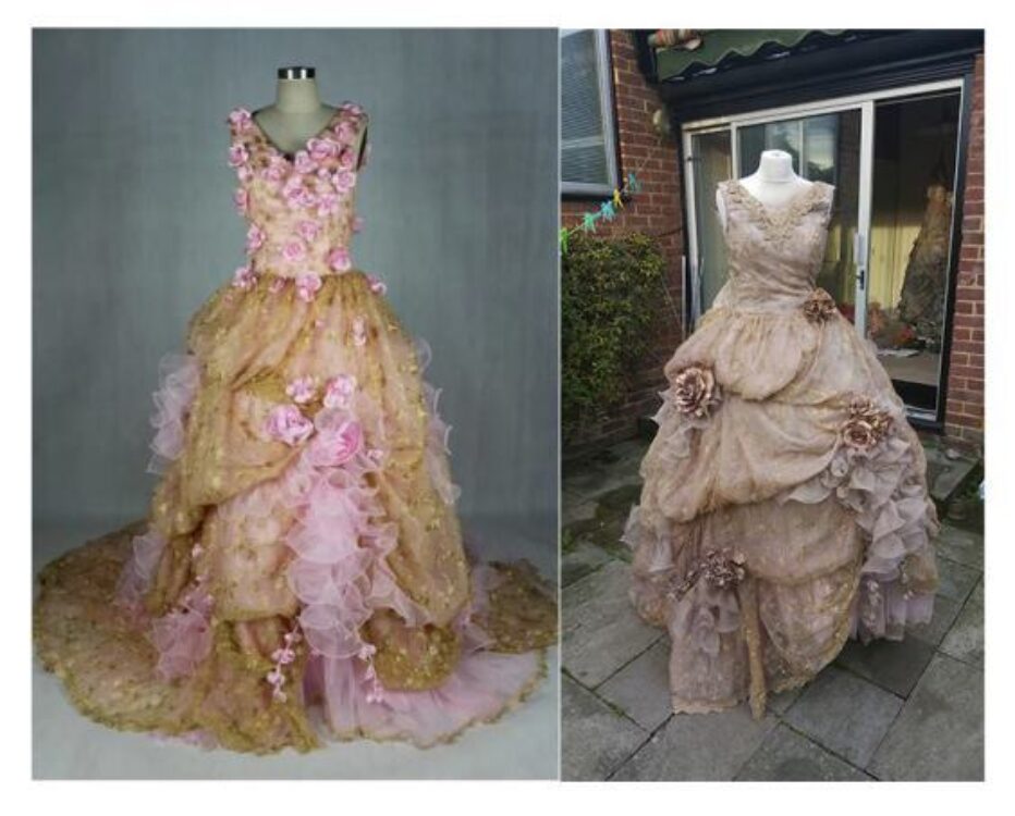
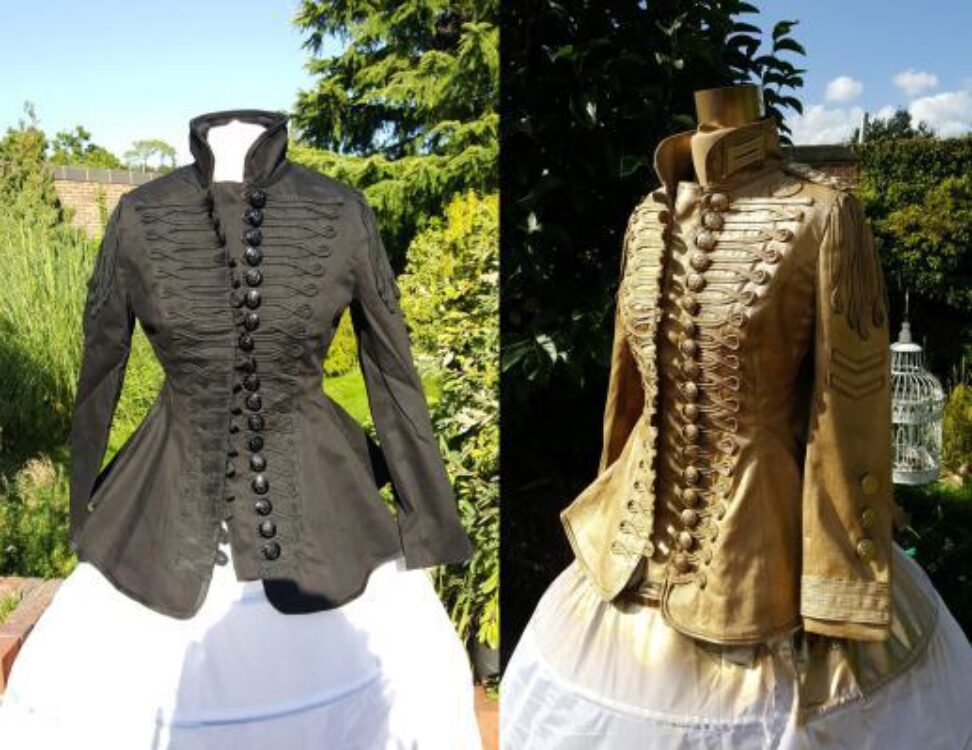
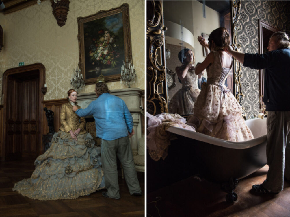
For Chique, we again commissioned some dresses from China, but we left more time so we could do our own bit of work on them. The dresses when they turn up from China are just a starting point, like raw photo files. Cue customisation, spray paints, culling of tacky flowers… a full ‘make under’: here are some before and afters by Matt.
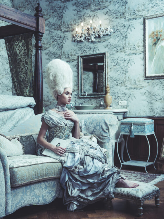
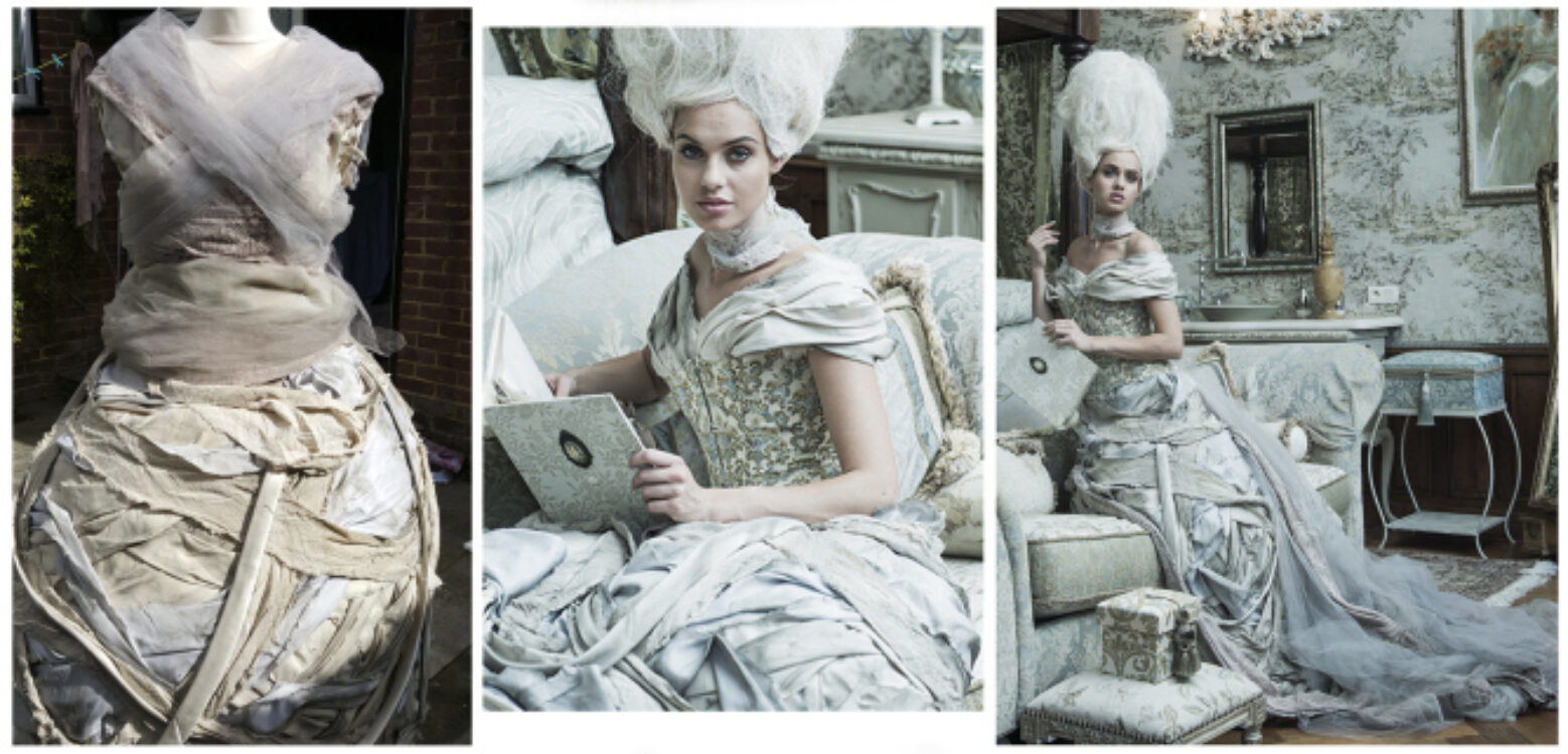
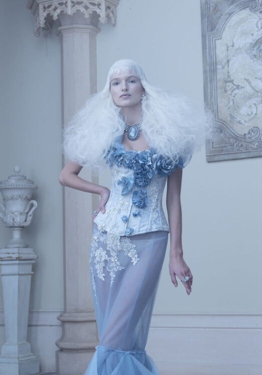
A third dress concept of Matt’s was a ragged Cinderella-inspired dress (below, and seen at the top of the blog post) which was teamed with a muted floral theatre corset, huge wig, piles of tulle and a neck collar, but kept minimal with no accessories to continue the idea of more a ragged servant girl than an opulent character. (This look worked better than I anticipated and I enjoyed shooting her in a bedroom decor that perfectly suited the look.)
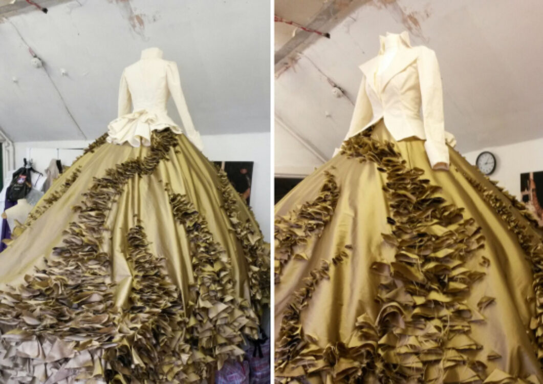
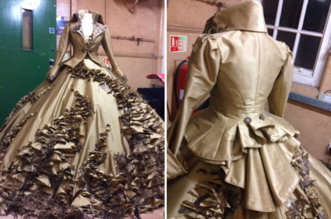
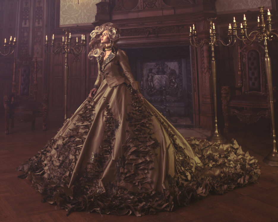
We also set aside a pretty penny to commission designers in London and Germany to make bespoke pieces. Wendy Benstead was commissioned to make two showpiece dresses. The first was a fitted jacket with voluminous textured dress. We wanted an autumnal feel, and on our moodboard below we had hints of a fairytale fungi-laden wood scene. The jacket evolved into a quirky military jacket – my favourite part, delightfully ‘wrong’ in terms of era – with wild collar and cuffs.
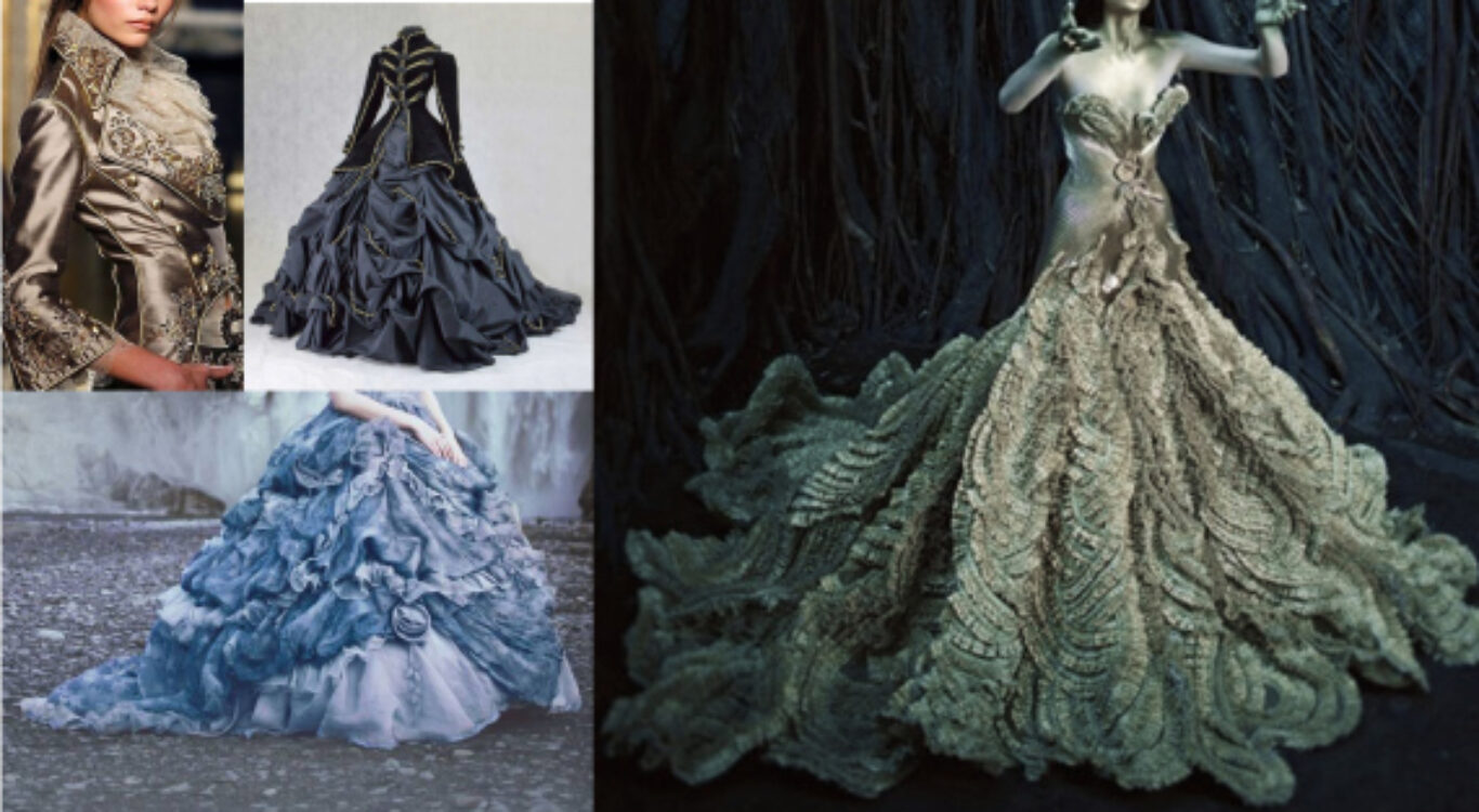
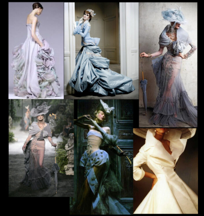
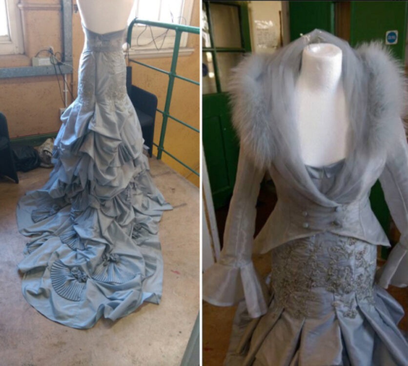
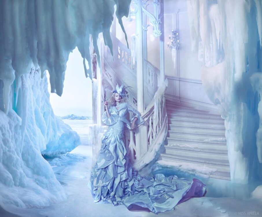
The brief for the second dress was to make a Dior-style, blue dupion dress with large open collar and matching hat. Slimmer-hanging than the other, with delicacy, pastel tone, and fan shapes decorating the skirt, and hat. The moodboard is below.
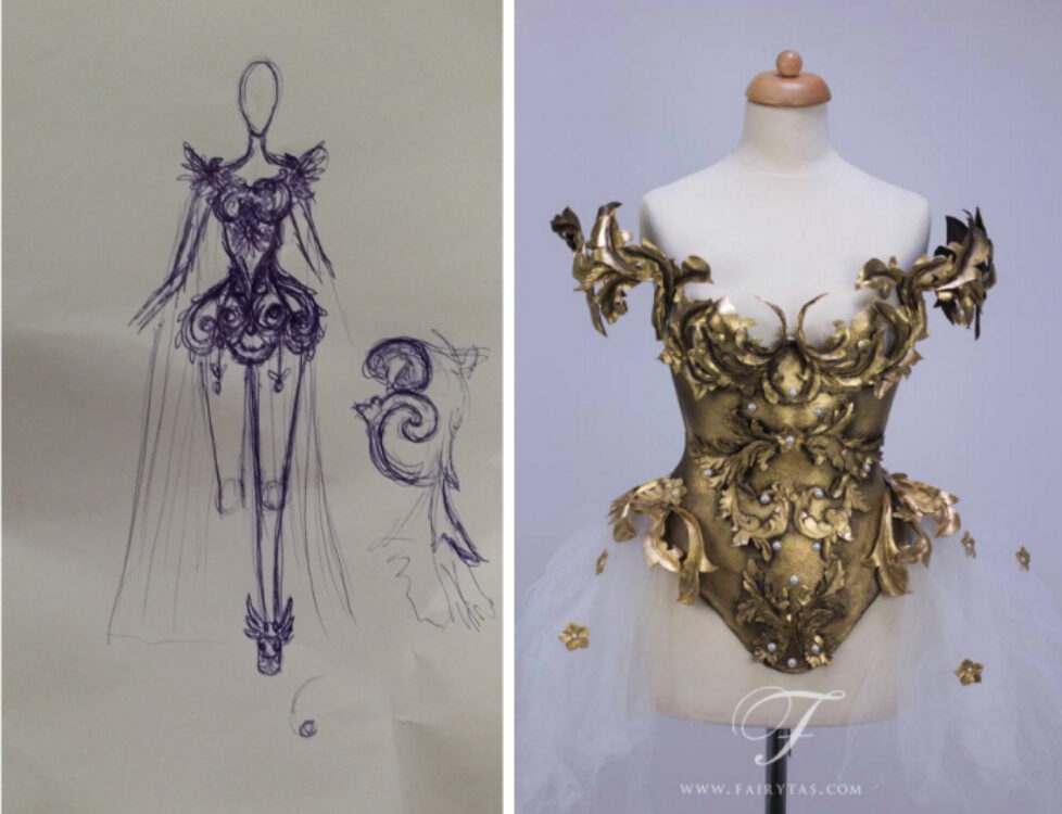
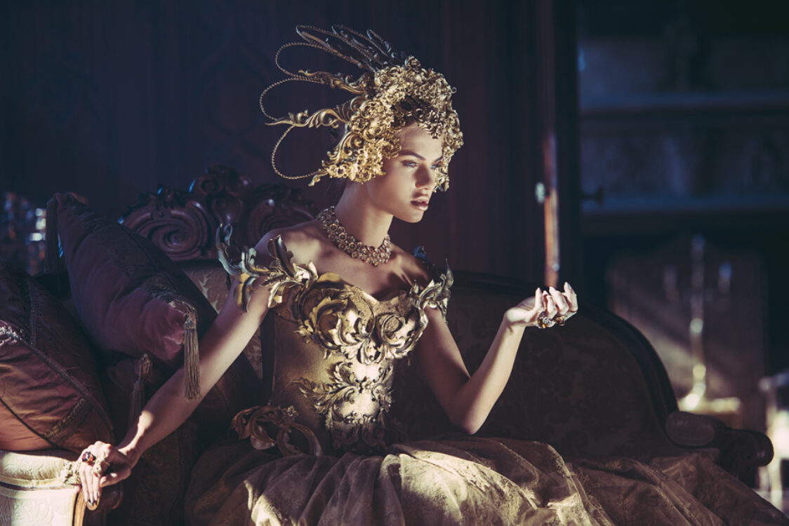
Another piece we commissioned was from Jolien of Fairytas: a golden corset in baroque, Tex Saverio style.
In working with designers, we’ve learnt it’s not always easy, even when you have a good budget. It is about ongoing communication, giving as full a brief as possible initially but also checking in on them to see pictures of the progression – even better, going in to visit. Leaving the brief ‘brief’, or completely wide open is dangerous, just as it would be if a client tells a photographer that they don’t mind what image they produce. A creative is hired to use their specific expertise, but a brief must still be as full as possible. When the client see the results they will know that indeed they had a brief even if they couldn’t articulate it.
Happily, all pieces were completed on time. In addition to the commissioned dresses, our stylist Minna Attala sourced extra and back-up looks. Dresses of her own making, dresses from National Theatre, and some pieces from her own designer connections including Della Reed, along with sacks of accessories and shoes. In addition, we had make-up/hair/designer extraordinaire Rachel Sigmon join the styling room. She brought oodles of wigs, hairpieces, and a gold dress I loved so much I shot it 4 times (seen in Dawn Treader and Marooned further below).
Matt also brought along his big box of tricks to add to the mix, including reams of pearls and his prized set of tea-stained vintage stockings (my worries about him still do not cease) This time, we did not have airline capacity to worry about, our trailer was huge enough to bring everyone’s kitchen sink if we wanted.
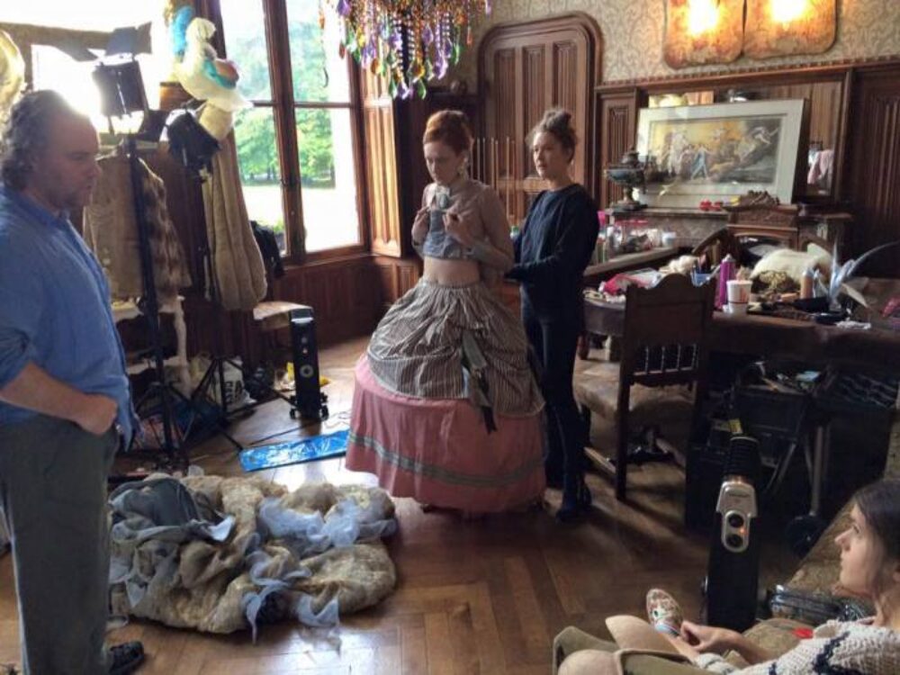
Costume keying into the location
Because this was the second time for me at Challain, my own goal was to make images in different areas than I shot last time. My favourite room of the whole place is the Taxidermy Room, but having already shot a favourite image in there, I steered clear entirely and focused on the staircase, the entrance hall and bedrooms. I also wanted to shoot outside with the chateau in the distance (but didn’t manage that). Matt wanted to revisit the kitchen and create another (better) hazy atmosphere in there.
Models
Our model line-up was completely familiar, all models we’d worked with before. This gave us confidence and relief. Kim, our redhead muse; Monica and Anita who’d joined us in Lanzarote, and Kristina, who we’d shot at Belvoir Castle in our picture The Governess.
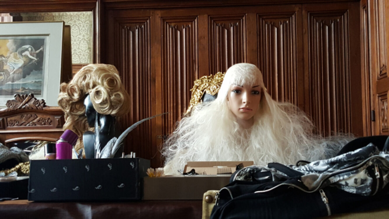
Makeup & hair
We wanted elegant hair and makeup like last year’s, but toned down the use of synthetic hairpieces in general, using more headpieces and natural hairdoes. Rachel Sigmon did make some fancy wigs on the fly: ‘hair helmets’ as she named them, and these were amongst my favourite looks. Rachel, who juggled makeup, hair and some dresses too, had been discovered by Matt via Facebook and we’d been communicating plans via pictures over FB messaging for some time.
Workflow
Now to put it all together. As usual, here is where I step in and make Matt’s months of planning worthwhile.
On an FSE we have multiple photographer set-ups going on at once. We’d start shooting around 11am each day, photographers being loosely designated spots to work in (though roaming was permitted as long as no-one trod on each others’ toes). I shot alone, with Matt on hand when he was not helping someone else, otherwise assisted by Aneil. Baby Lilith would either be parked next to me in a pram, or scooped off to the TV / internet room to join her cousin and auntie. As she’s breastfed on demand, I’d feed her on set or take a lie down on one of the many beds around – the location lent an advantageous relaxed atmosphere and there was plenty of time, so the shoots were fairly easy-going, lots of time to set up, think, try options, and spend ages tweaking to get it just right (tweaking the pictures, that is…)
I took my iMac to France (enough room in the trailer for everyone’s kitchen sink, remember) so I could off-load and even do some editing in my room each night.
Camera & lenses
For all shoots I was working with my Nikon D810 and mainly alternated between 24-70mm and 50mm lenses (with some opportunist telephoto shots). Eternally the question in my mind is how to get close enough to the model to show off her wares, whilst backing off enough to show the contextual location in all its elegance. Sometimes this is achieved through the 24-70mm lens alone, sometimes it is achieved through stitching panoramically with the 50mm lens. As much as I can I shoot both options. Stitching does mean better resolution in the end.
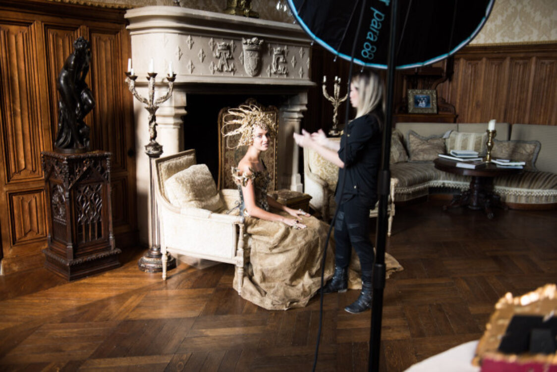
Lighting gear
For me nowadays, lighting is crucial on every shot in a place like this. For the majority of the time, relying on natural light just doesn’t cut it, except for some off-the-cuff 50mm portraits. Sometimes a brilliant shaft of light would shine into a room and lend the temptation to shoot natural, but I’ve learnt now that it’s mostly misleading, leading to high contrast and blow-outs on skin. The general plan of action was to shut out as much light as possible and shoot with strobe.
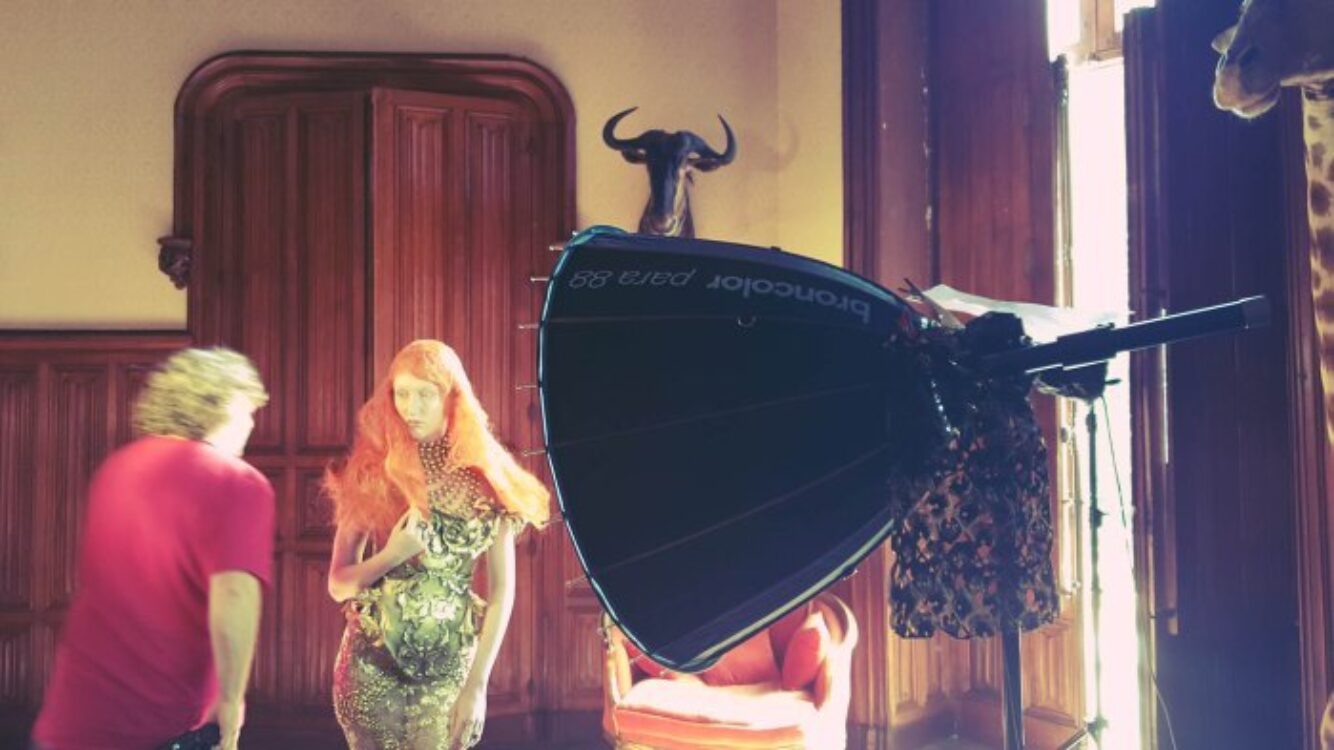
We used broncolor Move 1200L kits with a variety of modifiers, and we would manoeuvre the kits around the chateau from one room to the next with the help of our assistants. It’s a big location but we had time and plenty strong arms.
Dawn Treader is my overall stand-out from the week and the shot I edited first of all – the equivalent of last year’s Elegant Elegy(see the dedicated blog post on that, A Creepy Fairytale with Broncolor). This was shot with one of Rachel’s ‘hair helmets’, teamed with her gold dress too. Step in our redhead muse Kim, with taxidermy my favourite thing, shut the shutters and step her on a ladder, and we had a scene in-camera that gave me goosebumps. Oh and Matt insisted on replacing the burnt out bulbs in the candelabra which I am now thankful for. She became a nightwatchwoman, surreally tall to let the dress hang in its full flow, and an eerie expression of Tilda Swinton. I was in love.

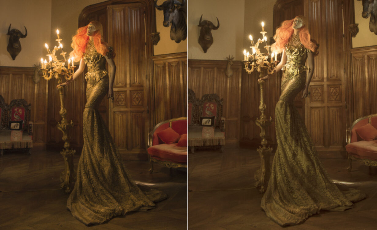
Editing was very straightforward for this one, I knew what I wanted. It was just a case of the right image selection. Above shows my main quandary: which of these two poses? I loved the moving forward pose of the left, decided that must be the one, so I made sure it was pin-sharp, and went ahead stitching and editing.
However, I just couldn’t shake off the gut feeling that the pose on the right was better. I’d actually used this shot to do a quick mock-up back at the chateau on my iMac. I kept looking back at my mock-up, trying to encapsulate its essence that was missing from the new ‘properly done’ version, and not feeling it was quite there. Thinking I’d just chosen that shot in haste, I realised that my haste was actually instinct of choosing the ‘right shot’. Sometimes we work better when we don’t think too much and go with our gut reaction! The left pose made more sense in terms of walking i.e. ‘treading’ the dawn, as it’s more animated, and yet I couldn’t deny that the more static and reclined pose on the right did something for me. I decided to revert. Heart over brain, I have to go with what I ‘love’ (as long as the shot was just as pin-sharp… and luckily it was perfect).
Stitched together, the final image barely took a Curves adjustment which is a rarity; it already has so much colour and contrast in there, with the bright orange setting off the frame. It was important to me to preserve the tungsten hue of the image, but not to over-muddy the tones. I even wonder whether it’s still over-processed.
Now for a little more of an unusual editing approach…
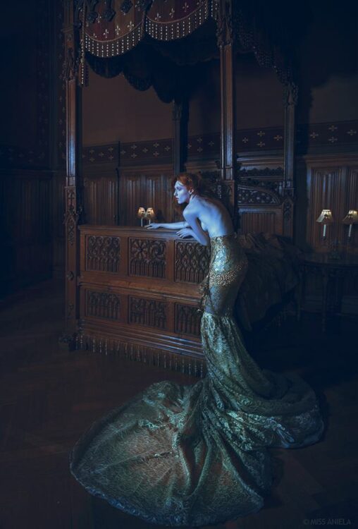
This was shot in the King’s Room, with one of my favourite aspects of the chateau: a wooden, stately four poster bed with interesting carvings and texture.
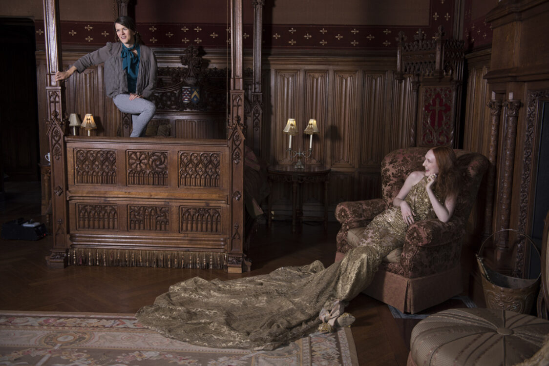
I shot Kim around the room and finally ended up in the corner you see above. A fairly simple pose by the bedstead was the final place, and the one where I took the most shots, inspired by the simplicity and lines of the composition. This was lit fairly simply with the Para 88 at top camera le
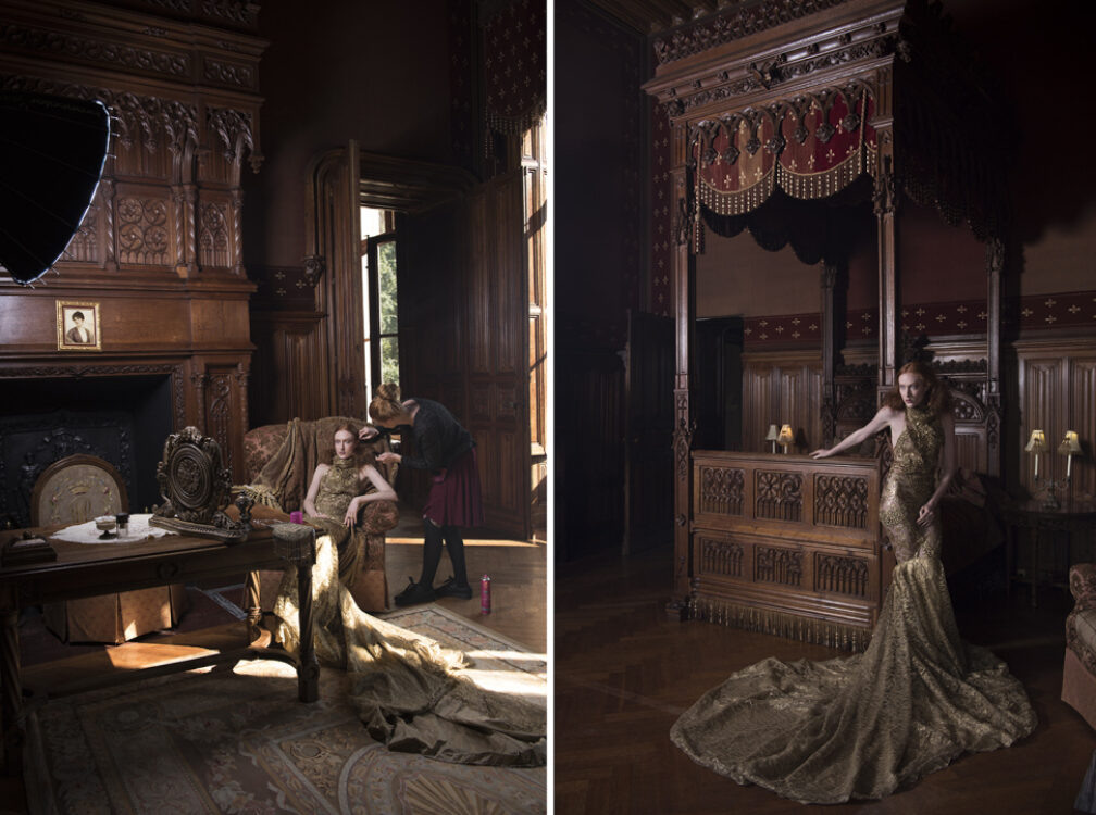
I loved the synergy of golden tones in the scene. But things took a surprising turn in the editing to create Marooned. I felt compelled to turn down the temperature to make the dress markedly cool, isolating it a little from the surroundings by using a brush in Adobe Raw. It seemed that this frame in particular lent itself mystically well to this unorthodox editing change (other shots didn’t look so good to me when I tried the same technique) and I saw something mermaid-like and otherworldly as I continued. I was unsure, but I decided to continue (recognising that hesitation happens a lot in creating my favourite images!) I edited most of it that evening hunched over my laptop on the floor of my chateau bedroom (I didn’t even make it to my iMac because I was so eager, i.e. lazy) and showed it on my iPad to Kim at dinner – who said she loved it (I was pleased as she’s usually nonchalantly honest with a mystifying pokerface about most images…)
Now onto a far more intricate piece which, unlike the images I’ve shown so far, took a great deal more time in post-production. Weeks, in fact, of editing in Photoshop which is partly why this blog post has been a long time coming…
We had Kristina in the Wendy Benstead blue dupion dress, teamed with a bird hat by Rachel Sigmon, a neck piece by Della Reed and accessories hunted by Matt (I’d road-tested the brooch at dinner in Newhaven a few weeks prior, naturally).
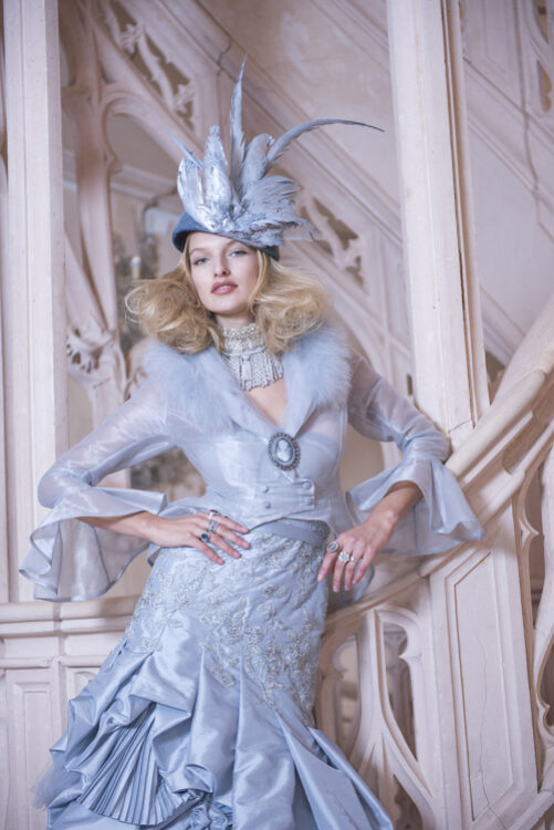
Pulled together by stylist Minna the final look was stunning, and not difficult to take a bad portrait of. But we decided to spend all morning perfecting the trickiest shot in the chateau: the staircase. The staircase is like a tricky lover: looks easy enough on the eye, till you try to make it work and you find yourself rebuked. The lighting is uneven, with multiple shadowed areas and light sources upon it. Below are the first shots we took which show how difficult it started out.
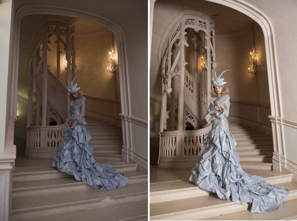
Here’s how we developed our set-up.
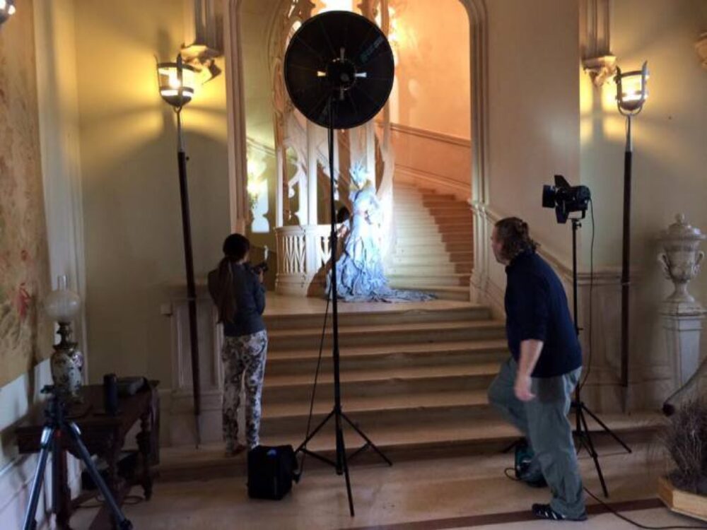
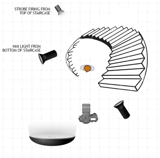
The result gave enough front fill and evened out the back and side areas of the shot. The dark top of the staircase was the main difficult spot that we wanted to lighten up. Once lighting was ‘nailed’ as Matt duly announces, it was time to tie down composition, and I was on a consistent mission of shooting the staircase fully and frontally, showing it all off in the frame. I shot tilts to one side to stitch the image.
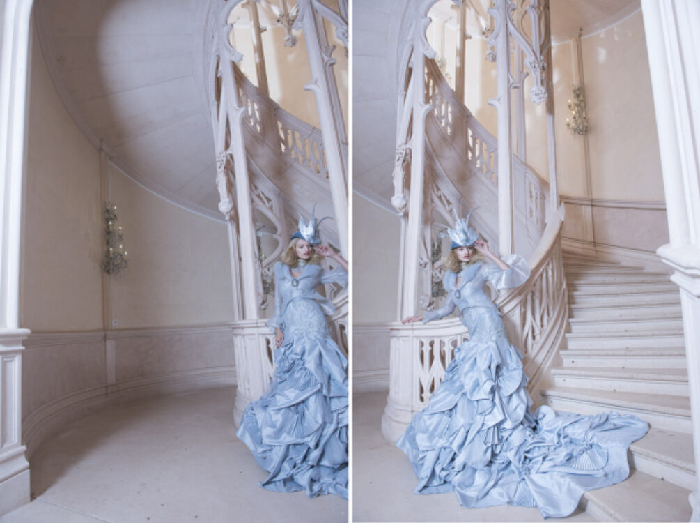
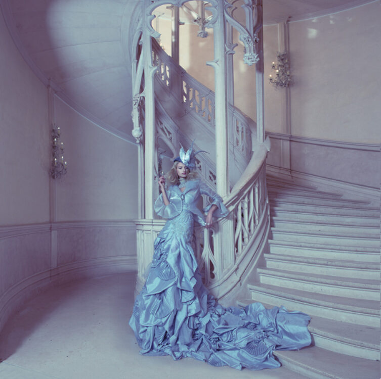
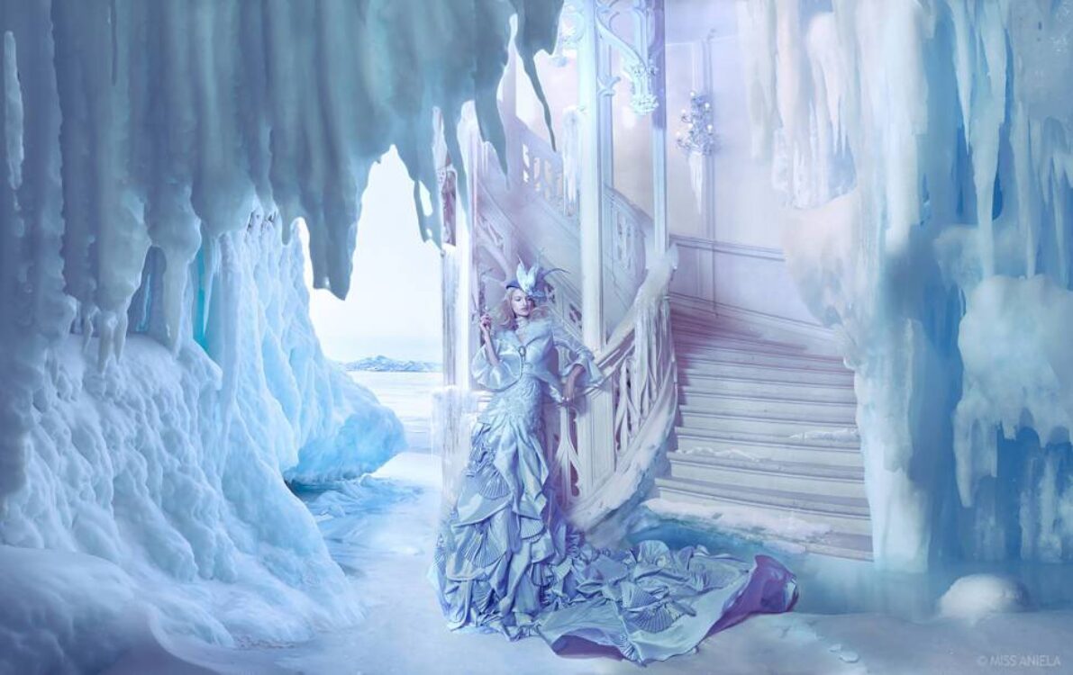
In editing, once it was stitched and cropped, I arrived at a square format which showed off staircase, dress, side passageway, chandeliers – and space for potential surrealism. It had to go somewhere, but where? My first thought was birds, to go with the bird hat. Birds flocking from her dress. Looked crap. So I changed tact: water. Water coming down the stairs? Splashing down the banisters? I spent a good many hours trying out this approach with stock water images and thought I had it. Until Matthew suggested redoing the whole thing with: ice.
I used landscape imagery more ambitiously than I ever have done: building out the canvas quite a way both sides, extending the scene to become panoramic.
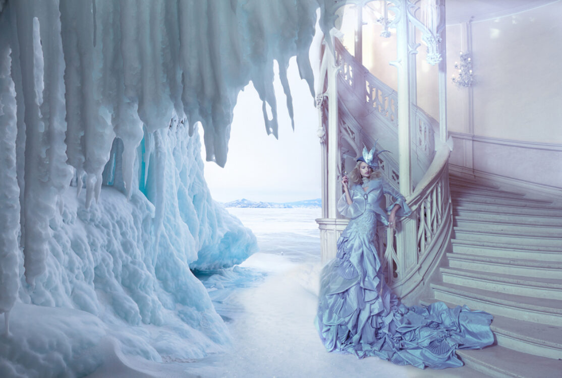
As soon as I put on this first left side, I could see it was working in terms of lighting, and, to my delight, the stark shapes of the icicles at the top middle took on the effect of coming ’round’ the staircase, making a quality hinge for this inspiration of this composite to continue. It kept me going, for I needed this reassurance to battle through the right hand side which took more effort, and multiple stock ice images to get right, creating the effect of a pool at the bottom of the stairs. I then tried water trickling down the stairs, but this was an ostentatious step too far, so I swapped it out for simple lumps of ice. Compositing is as much about taking stuff away as it is putting things in.
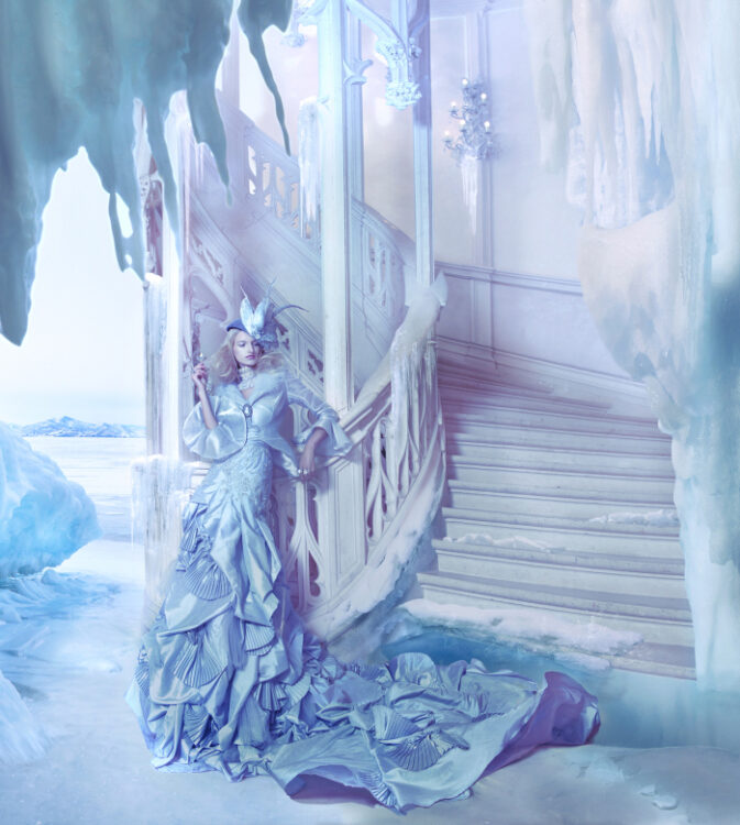
Once composited, I used some simple Curves adjustments to ‘glue’ the whole image together (but not ruin skin tones or muddy the whites too much, important in an image with snow/ice), and the usual airbrushing to make the model and dress as beautiful as possible, and finally a couple centuries later the whole piece was satisfactorily complete.
Below is the final image in its full dimensions (and further below, a cropped version to see in closer).
More on lighting
Here is one of my favourite lighting set-ups from the week. A shot began with model Kristina styled in a corset by Minna and hair helmet by Rachel. The lighting progresses through these shots to reach the result further below.
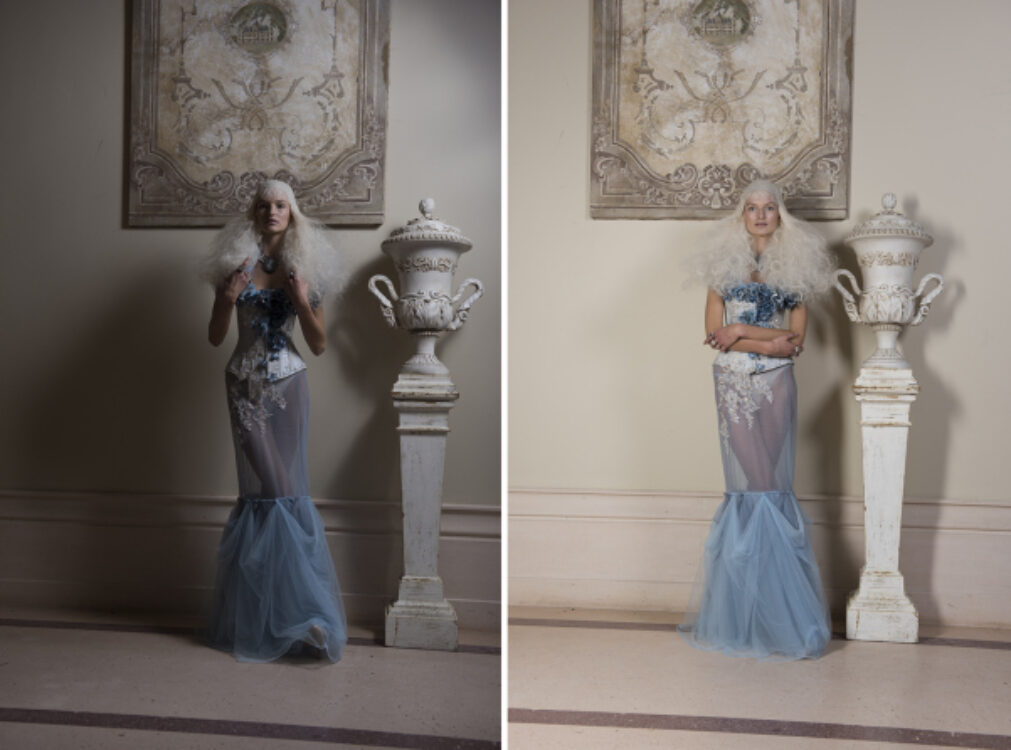
We began with Kristina up against a wall and lighting far too frontal. We developed a lighting set-up which would give a soft overall fill, having two strobes firing away from the model to bounce the light. On left was a stripbox and on the right, the Para 88.
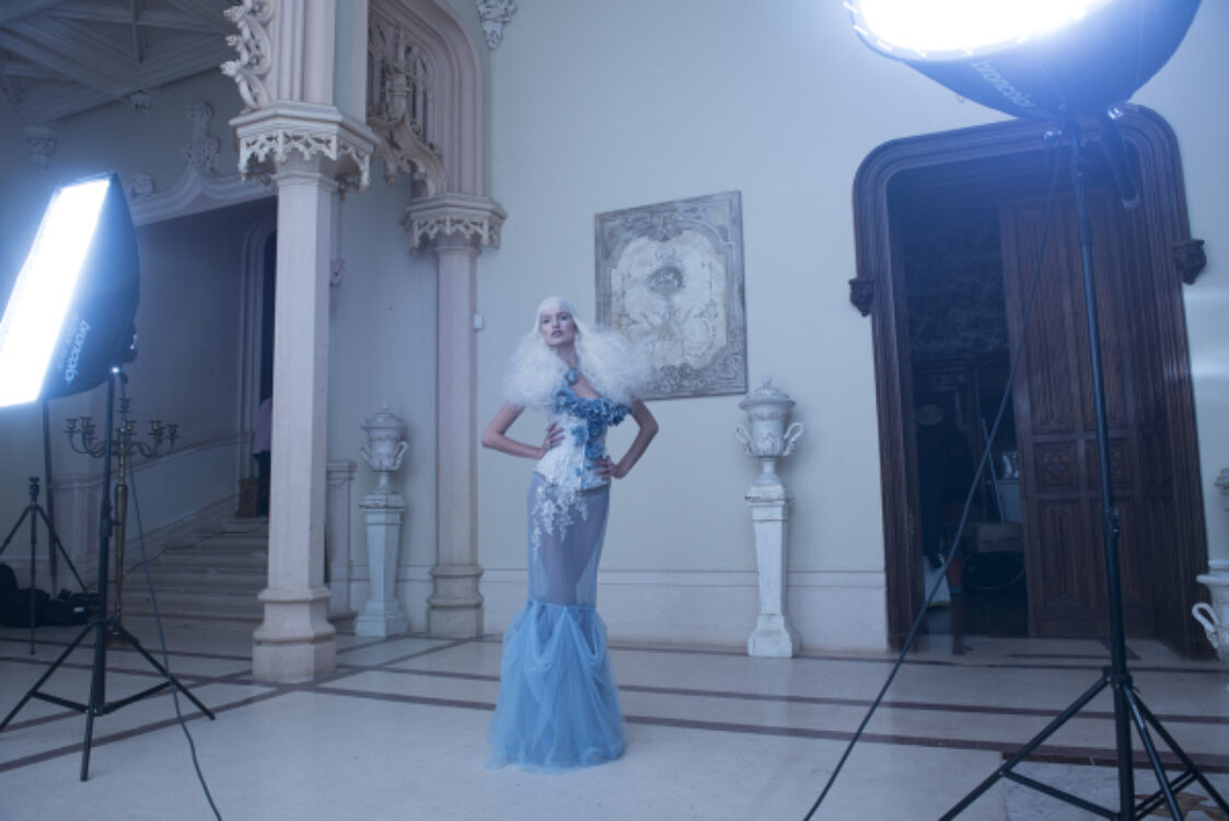
We experimented with different power settings to give a variety in look. Ultimately it is the moment she steps forward away from the wall that the lighting and softness transforms the mood.
Challenges
Taking care of a group of other photographers is the main challenge of our FSE event, combined with having to think and shoot creatively for myself as a participant too. On this shoot we had a smaller, more intimate group of participants (six other photographers) which made life more manageable, luckily no huge setbacks minus the usual (expected) minor dramas getting all models to the chateau on time.
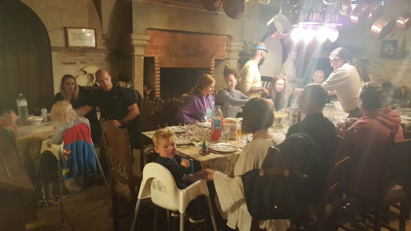
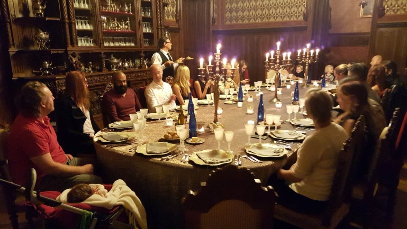
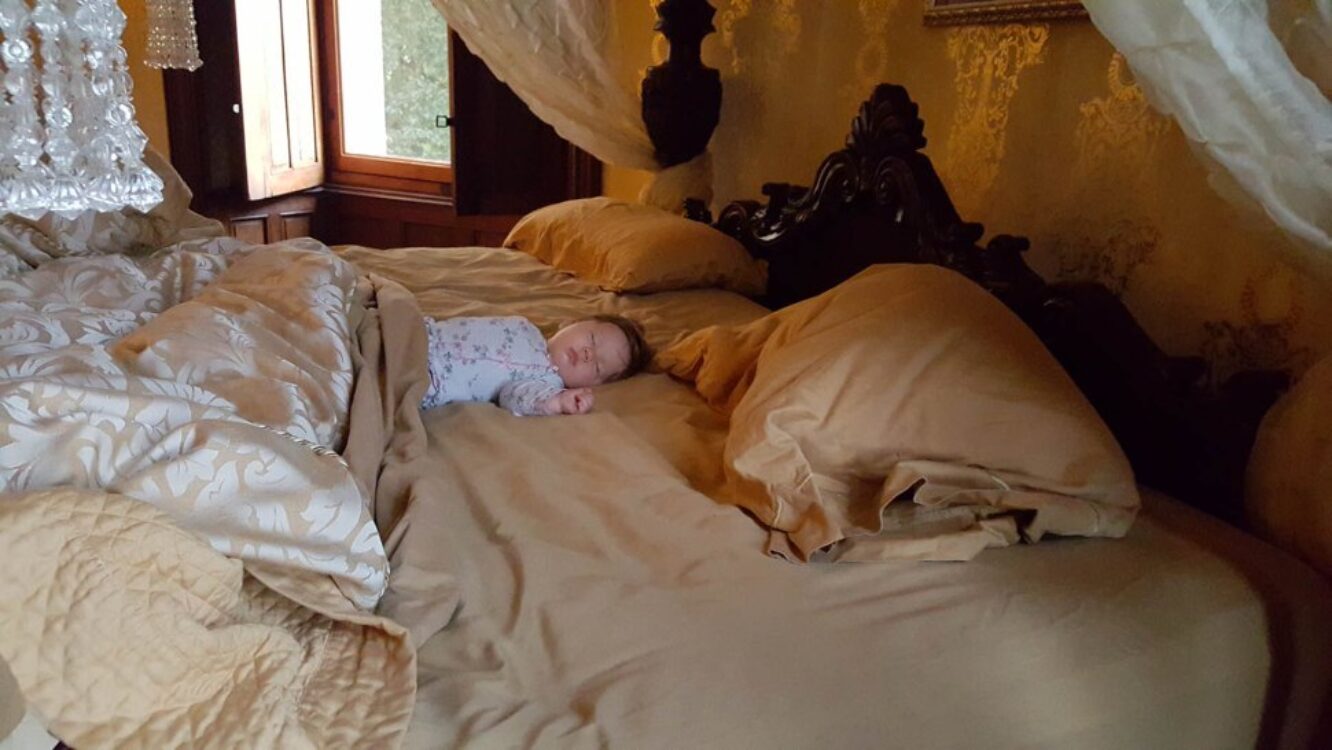
We brought our brother and sister-in-law (with their little boy Hunter) to help caretake our baby Lilith, and had no shortage of extra help from the doting stylist Minna (or anyone else who fancied a baby hug). And as much as I’ve been long ogling the baby cribs in the chateau, awaiting the day I bring my own baby, Lilith was happily tucked between us each night where she belongs, in our four-poster bed like a babe of leisure.
CREDITS / WITH THANKS TO…
All our participating photographers: Jan, Anna, Janelle, Marco & Lynne, Lara, James
Models: Monika Gocman, Anita Sikorska, Kim D, Kristina Vaiciuniate
Designers/wardrobe/styling: Wendy Benstead, Fairytas, Minna Attala, Rachel Sigmon / Posh Fairytale Couture, Della Reed, Jolita, National Theatre
Makeup & hair: Grace Gray, Rachel Sigmon
Assistants: Daniel Lennard, Johnathan Clover, Aneil Sharma
The hospitality & grandeur of Chateau Challain
broncolor, Lupolux Photo, Nikon, Manfrotto, ThinkTank Photo
About Miss Aniela
‘Miss Aniela’s colourful, often surreal images are cerebral and sexy, intimate and public, all at once’ (American Photo)
Aniela is the middle name of Natalie Dybisz, a fine-art fashion photographer based in London, UK. Originating as a self-portrait artist in 2006, Miss Aniela’s work has been exhibited internationally and featured in numerous media including NY Arts, El Pais, ALARM Chicago, Vogue Italia and BBC.


